![]()
Following on from my recent foray into logo design, I was interested to see Damien Katz’s recent call for a logo for his excellent open source project: Couch DB. Would it be an opportunity for a follow up?
Somewhat hard to explain in layman’s terms, Couch DB is basically a system for storing the data for your web application in a series of flat files that can be accessed over HTTP. What’s special about Couch DB is that it uses two technical standards very much in vogue at the moment: JSON, a very lightweight data format from Javascript and REST, a web service architecture that involves the manipulation of individual resources through HTTP calls to sensible unique URLs. Couch DB competes with relational databases (such as MySQL) to act as the persistence layer in web applications, i.e. where you store your data when it is not actually in your running programming being manipulated.
Anyway, after my success with The Ape logo, I thought it might be fun to try to put something together for Couch DB as well. Like in The Ape project, there was some obvious imagery to start with: the logo was gonna have something to do with a picture of a couch. Here were my initial sketches:
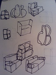
As you can see, I started out trying to work the projects initials into the form of a couch and gradually gravitated to a simple geometric abstraction of the couch as a medium for that.
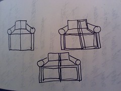
Next, I took these sketches into Illustrator and tried to mechanically recreate them there. I wasn’t very happy with the result of a simple line drawing recreation of this imagery. It looked anemic and amateurish. So, then I went through and tried to use actual text settings of the project’s abbreviation to construct the couch (some arrangement of a ‘c’, a ‘d’, and a ‘b’ that would get the picture across). This didn’t get me very far either as a I kept ending up with something that looked a lot more like Darth Vader’s mask than a couch. Throughout this process I was constantly adding a few purely geometric elements to try to get the letters to coalesce into something with the silhouette of a couch. Mostly I was using rounded rectangles with thick strokes as those matched the font I’d been using.
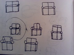
Slowly but surely, the letter forms fell away and I was left with the simple arrangement of rounded rectangles and circles that made up my final couch sketch. I added the three different weight strokes between the two rows of rectangles and the circles to give it some visual variety and rhythm. The end result was an abstract drawing of a couch that felt pretty right for this project to me: there’s just something about rectangular boxes, empty and waiting to be filled that cries out “document store!” to me. Plus the form reads really well at all scales from large to extremely small (it would make a great favicon), which was a major advantage for this kind of logo that will get used in a whole smorgasbord of formats.
Then, I was left with just the problem of the text setting remaining. I went for something simple: a basic Century Gothic setting with some slightly enhanced width to the strokes. To match the playfully round shapes of the couch itself — and to get some color contrast — I made the text white on the black rounded background. I liked how the ‘B’ in ‘DB’ formed its own version of the rounded rectangle, so I left it off on the right side, letting the letter forms make up the difference. The text handling here doesn’t quite live up to the couch icon itself, which I was quite happy with. It’s the kind of thing I’d like to iterate on in conversation with Katz if he’s interested in my logo.
And it looks like he’s going to have a fair number of options. When I returned to the original blog post to submit my work, I discovered that two other people had beaten me to the punch: Bryant Cutler put together this very professional (if a little generically vendor-y) submission:

And Patrick Hall put together this admittedly slapdash proposal:

Anyway, it’s nice to be in good company trying to help out a great little open source project like Couch DB and I’m excited to see which submission catches Damien’s fancy. It’s funny to have gotten into this improvised design competition. While I think there might be space for a collaboration between my and Bryant’s designs, and the spirit of the whole project is very community barn raising/feel good open source-y, having that competition makes me perversely competitive. Part of me wants to win, dammit! I’ll let you know how it turns out.
The good thing about your information is that it is explicit enough for students to grasp. Thanks for your efforts in spreading academic knowledge.