Compelling vs Compulsive Games: Threes, Super Hexagon, and The Replay Urge

Note: As part of an independent study this semester at the MIT Media Lab on game design, I’ve begun blogging about games here:playedgame.tumblr.com. I’ll ocassionally cross-post more developed pieces like this one, but feel free to follow that Tumblr if you’d to read more of my writing about games.

Like their coin-op arcade ancestors, today’s casual mobile games live or die on their ability to create The Replay Urge: that itch you get to play again immediately at the end of each round. The Urge consists of complex emotional components: the frustration of failure, the drive towards self-improvement, the joy of skill development, the tactile pleasure of manipulating an interface, the inherently addicting quality of random rewards.

Games that induce enough of these become “addicting” and find success through deep user engagement and viral spread. Beyond commercial success, however, the specific mix of components a game uses to achieve addictiveness determines its aesthetic effect: whether or not it is actually fun. Depending on each game’s particular combination of these components the result can be truly compelling or merely compulsive.

Compelling games reward you for repeated play, investing the time they extract from you into a deepening experience. Usually this means the gradual building of skills. Each round of play, however frustrating, acts as practice, building reflexes and sharpening systemic understanding. Compelling games repay your time investment with the feeling of mastery.

For me, an example of a compelling game is Terry Cavanaugh’s Super Hexagon.

Super Hexagon is a brutally hard, fast-paced obstacle avoidance game where you rotate a small triangle to avoid a series of incoming geometric patterns of walls. The goal is to survive for 60 seconds on each level of difficulty without crashing into any walls. As a beginner, dying almost immediately is routine. The game displays your survival time down to the hundredths of a second.

However, with each repetition you slowly build skill: increasing the speed and precision with which you move, learning how to avoid new patterns of walls, executing more consistently. You gradually survive longer and, eventually, beat each round. The difficulty ramps up smoothly as your skill improves, the current speed and batch of puzzles always seeming frustratingly impossible and the just-completed ones insultingly easy.

Despite having played for countless hours, I’m proud of having beaten the Hexagonest stage and one of the three Hyper Mode stages (and of my current best time of 58:29 on “HARDESTEST”). These hours (built out of binges on long bus and plane trips and carved out of the interstices of the day) were devoted to building a skill. And, however arcane and useless that skill, its very difficulty gives it value to me.

Compulsive play, on the other hand, wastes the time it wrings out of you. While compulsive games successfully kindle the Replay Urge, they fail to convert the resulting repetitive play into sufficient skill building. Playing compulsively leads to a feeling of self-disgust that grows stronger the longer you play. And it leaves behind no pride or skill, but only wasted time.

For me, Threes is an example of a compulsive game. Created by Asher Vollmer and team, Threes is a clever variation on the Match Three genre of puzzle game made ubiquitous by Bejeweled and Candy Crush Saga. It presents you with a 4-by–4 grid, sparsely populated with numbered tiles. The goal is to merge tiles, combining their values into an ever-growing sum.

On each turn, you swipe the grid left, right, up, or down, merging adjacent tiles that match, moving tiles into empty squares, and making room for the next arriving tile. White tiles start at 3 and match if they have the same number, combining into a doubling sum: 3s combine into 6, 6s into 12 and so on. Red and blue tiles, numbered 1 and 2, can only be merged with each other to create a 3. When your board is full and there’s no swipe direction that can merge two tiles to create an opening for the next tile, the game is over. You’re rewarded for creating the highest numbered tiles, with scores increasing geometrically with each doubling.

The game has a minimalist style and satisfyingly smooth touch interactions both of which are highly reminiscent of Loren Brichter’s Letterpress. On first playing, it’s natural to enjoy simply batting the board back and forth, watching a few tiles merge as the empty spaces quickly fill up until the game ends.

However, the problems begin as soon as you knuckle down and start trying to build skill and learn strategies to improve your score. Upon first hitting this phase, I wasn’t even sure if it was possible to have a strategy. Tiles seemed to arrive randomly, my options for how to deal with them were extremely limited, and, once the board started filling up, there didn’t seem to be any way to empty it again.

After seeing Sermad Bruni tweet an impressive score, I asked him for tips and he replied with a few.

All of these are techniques for maintaining the maximum number of move options. As rows or columns on the Threes board fill up with un-combinable tiles, swiping no longer moves them. When multiple red or blue tiles end up next to each other or move into the interior of the board, they become impossible to match and cause the board to quickly congeal. Large-numbered tiles have a similar effect.

After putting this new understanding into action, my results improved somewhat. I started routinely scoring in the 2,000–4,000 range and, even had a couple of games where I constructed a 384 tile and scored over 8,000.

I began to see that Threes does require certain skills that can be learned and improved. Like with a Rubix cube, a toolkit of move combinations can be learned by rote to handle specific tactical situations: the leftward move that keeps two tiles on an outer row or column centered to leave more options to handle arriving tiles, the choice not to combine neighboring red and blue tiles in order to first correctly place an incoming tile, etc.

However, my skill quickly plateaued. I wasn’t able to come up with any additional strategies that would improve my results and there were no Super Hexagon-like twitch skills to practice. Regardless, the power of the game’s Replay Urge kept me playing long batches of repeated rounds, my sense of self-disgust growing.

I began to suspect that Threes is merely a compulsive game.

But then Ashley Esqueda tweeted a link to this TouchArcade post by a user, y2kmp3, who created the highest-numbered tile in the game: 6144. y2kmp3’s post describes playing a single game of Threes for 10–15 hours to achieve this result. Rather than batting tiles back and forth y2kmp3 plans each move like a chess grandmaster, considering options and repercussions across a number of play sessions. This could not have been more different from the way in which I was playing Threes. Coming across this thread was like discovering a completely different game being played with the same pieces and rules I’d been using.

Part of what boggles the mind about such an effort is that Threes doesn’t seem to give you enough information to conduct long-term planning. At any given point you know the state of the board: the potentially squashable pairs, the free directions of movement, and the next tile. That’s it.

The other two key elements of the game, on the other hand, are random: which tile will come next and onto which of the multiple open squares it will drop. (y2kmp3 also seems to have a mental model for proportional odds of future tiles, as expressed in their image of the “stack”. This would help manage the latter source of randomness but is, as we’ll see, a very advanced skill; I have no inkling of it after 10–15 hours of play.)

The presence of these random elements distinguishes Threes from Chess and Go and the other fully deterministic games where you normally see this kind of highly contemplative play. In these games the advantages or disadvantages of a proposed move could theoretically be fully analyzed given sufficient time, resources, and skill.

High-level Threes strategy is designed entirely around managing randomness. y2kmp3 describes aiming to “maintain two separate chains” of high number tiles in order to create the possibility of later merges. Apparently this strategy fails in the later stages of the game as higher numbered tiles began appearing in the stack and y2kmp3 was forced to change strategy to “create only one ‘high number’ tile card of each kind, so that whatever the random ‘high number’ tile card appears, you can make use of it to escalate.”

This is obviously quite different from a game like Chess or Go where high-level strategy emerges as a negotiation between game rules and player personalities. Chess gandmasters are known for their inclinations towards particular styles of defensive or aggressive play, how they value different intermediate game objectives like movement and king protection, whether they’re stronger in tactics or positional play, etc. High-level Threes play seems to offer no possibilities for this type of personality expression. Instead strategies are dictated by the composition of the stack and the odds that govern random tile appearance.

Beyond Threes’ limitations as a platform for high-skill strategic play, the game’s design has a bigger problem. Discovering y2kmp3’s post shocked me because the gap between that level of play and my own is so huge as to seem unbridgeable. Perusing the rest of that TouchArcade thread reveals an amazing research effort, chiefly lead by a user named kamikaze23, to reverse engineer the algorithm the game uses to populate the stack of next tiles. kamikaze23 solicited logs of Threes games from users, studied the patterns of tile appearance, and put together a speculative account of the algorithm that players like y2kmp3 use to the achieve their high scores.

The need for this kind of research to understand the odds of the stack is evidence of a profound discontinuity in the curve of difficulty vs. increasing skill the game presents to players. It implies that all Threes players will hit the wall of frustration at which I currently find myself, unable to improve our abilities through iterative practice. Only a tiny minority of such players will decamp to the abstract realm of research and statistical study that’s apparently necessary to reach the higher levels of play. Abstract systematic analysis like this is how we solve problems that don’t yield to our basic ability to learn from experience. They’re at the core of our most rarefied rational endeavors like science and mathematics. The incongruity of requiring this mode of thought in a causal game is profound.

As a game designer, I wonder about changes you could make to Threes to ameliorate this problem, to provide a smoother learning curve that would allow more users to ascend to these higher levels of play. The chief idea that occurs to me is to show the user more of the stack. The ability to see the next three or four tiles or more would facilitate longer-term planning and would make it easier to incrementally internalize the behavior of the complex stack algorithm described by kamikaze23. Further, currently all of the random elements are both biased against the player and purely destructive. I wonder if you could introduce an additional random element that would benefit the player and rebalance the game. Maybe a “wild tile” that could be combined with any neighbor like a blank Scrabble tile? This would let the player dig out of full and badly wedged boards and could result in an interesting set of strategic options around how long to save it and when to play it.

Threes is obviously a carefully considered game that was the product of a great deal of design work. So, I’m aware of the hubris of cavalierly suggesting changes like these without the ability to playtest them. For all I know Vollmer tried these variations and found downsides I haven’t anticipated. And creating a game with players as dedicated to discovering high-level strategies as y2kmp3 and kamikaze23 is an achievement in itself.

But, for me, as the game currently stands, playing feels compulsive instead of compelling and I regret much of the time I’ve spent playing it rather than feeling pride in it.

Posted in Opinion | 1 Comment

2H2K Lawyer: Science Fiction Design, Artificial Labor, and Ubiquitous Interactive Machine Learning

Intro

“2H2K: LawyeR” is a multimedia project exploring the fate of legal work in a future of artificial labor and ubiquitous interactive machine learning.

This project arose out of 2H2K, my ongoing collaboration with John Powers where we’re trying to use science fiction, urbanism, futurism, cinema, and visual effects to imagine what life could be like in the second half of the 21st century. One of the major themes to emerge in the 2H2K project is something we’ve taken to calling “artificial labor”. While we’re skeptical of the claims of artificial intelligence, we do imagine ever-more sophisticated forms of automation transforming the landscape of work and economics. Or, as John puts it, robots are Marxist.

Due to our focus on urbanism and the built-environment, John’s stories so far have mainly explored the impact of artificial labor on physical work: building construction, forestry, etc. For this project, I wanted to look at how automation will affect white collar work.

Having known a number of lawyers who worked at large New York firms such as Skadden and Kirkland and Ellis, one form of white collar work that seemed especially ripe for automation jumped out to me: document evaluation for legal discovery. As I’ll explain in more detail below, discovery is the most labor-intensive component of large corporate lawsuits and it seems especially amenable to automation through machine learning. Even the widespread application of technologies that already exist today would radically reduce the large number of high-paid lawyers and paralegals that currently do this work.

In the spirit of both 2H2K and the MIT Media Lab class, Science Fiction to Science Fabrication (for which this project acted as a final), I set out to explore the potential impact of machine learning on the legal profession through three inter-related approaches:

  • Prototyping a real interactive machine learning system for legal discovery.
  • Writing and illustrating a sci-fi comic telling the story of how it might feel to work in a law firm of 2050 that’s been transformed by this new technology.
  • Designing the branding for an imaginary firm working in this field.

For the rest of this post, I’ll discuss these parts of the project one-by-one and describe what I learned from each. These discussions will range from practical things I learned about machine learning and natural language processing to interface design issues to the narrative possibilities I discovered in my technical research (for example, the relationship between legal discovery and voyeurism).

Before beginning, though, I want to mention one of the most powerful and surprising things I learned in the course of this project. Using science fiction as the basis of a design process has lead me to think that design fiction is incredibly broken. Most design fiction starts off with rank speculation about the future, imagining a futuristic device or situation out of whole cloth. Only then does it engage prototyping and visual effects technologies in order to communicate the consequences of the imagined device through “diegetic prototypes”, i.e. videos or other loosely narrative formats that depict the imagined technology in use.

This now seems perfectly backwards to me. For this project, by contrast, I started with a real but relatively cutting edge technology (machine learning for document recall). I then engaged with it as a programmer and technologist until I could build a system that worked well enough to give me (with my highly specialized technical knowledge) the experience of what it would be like to really use such a system in the real world. Having learned those lessons, I then set out to communicate them using a traditional storytelling medium (in this case, comics). I used my technical know-how to gain early-access to the legendarily unevenly distributed future and then I used my storytelling ability to relay what I learned.

Design fiction uses imagination to predict the future and prototyping to tell stories. Imagination sucks at resolving the complex causes that drive real world technology development and uptake. Prototyping sucks at producing the personal identification necessary to communicate a situation’s emotional effect. This new process – call it Science Fiction Design, maybe? – reverses this mistake. It uses prototyping and technological research to predict the future and storytelling media to tell stories.

(Much of the content of this post is reproduced in the third episode of the 2H2K podcast where John and I discuss this project. The 2H2K podcast consists of semi-regular conversations between the two of us about the stories and technologies that make up the project. Topics covered include urbanism, labor, automation, robots, interactive machine learning, cross-training, cybernetics, and craft. You can subscribe here.)

What is Discovery?

According to wikipedia:

Discovery, in the law of the United States, is the pre-trial phase in a lawsuit in which each party, through the law of civil procedure, can obtain evidence from the opposing party by means of discovery devices including requests for answers to interrogatories, requests for production of documents, requests for admissions and depositions.

In other words, when you’re engaged in a lawsuit, the other side can request internal documents and other information from your company that might help them prove their case or defend against yours. This can include internal emails and memos, call records, financial documents, and all manner of other things. In large corporate lawsuits the quantity of documents involved can be staggering. For example, during the US government’s lawsuit against Big Tabacco six million documents were discovered totaling more than 35 million pages.

Each of these documents needs to be reviewed for information that is relevant to the case. This is not simply a matter of searching for the presence of absence of particular words, but making a legal judgment based on the content of the document. Does it discus a particular topic? Is it evidence of a particular kind of relationship between two people? Does it represent an order or instruction from one party to another?

In large cases this review is normally performed by hordes of first year associates, staff attorneys, and paralegals at large law firms. Before the crash of 2008, large law firms, which do the bulk of this kind of work and employ hundreds or even thousands of such workers, hired more than 30% of new law school graduates (see What’s New About the New Normal: The Evolving Market for New Lawyers in the 21st Century by Bernard A. Burk of UNC Chapel Hill).

As you can imagine, this process is wildly expensive both for law firms and their clients.

Legal Discovery and Machine Learning

Legal discovery is a perfect candidate for automation using recent advances in machine learning. From a machine learning perspective discovery is a classification task: each document must be labeled as either relevant or irrelevant to the case. Since the legal issues, people involved, and topics discussed vary widely between cases, discovery is a prime candidate for supervised learning, a machine learning approach where humans provide labels for a small subset of documents and then the machine learning system attempts to generalize to the full set.

Machine learning differs from traditional information retrieval systems such as full-text search exactly because of this ability to generalize. Machine learning systems represent their documents as combinations of “features”: the presence or absence of certain words, when a message was sent, who sent it, who received it, whether or not it includes a dollar amount or a reference to stock ticker symbol, etc. (Feature selection is the single most critical aspect of machine learning engineering; more about it below when I describe the development of my system.) Supervised machine learning algorithms learn the patterns that are present in these features amongst the labeled examples they are given. They learn what types of combinations of features characterize documents that are relevant vs irrelevant and then they classify a new unseen document by comparing its features.

Information retrieval systems are currently in widespread use throughout the legal field. One of the landmark information retrieval systems, IBM’s STAIRS system was even originally developed in order to reduce the expense of defending against an antitrust lawsuit in 1969 before being commercialized in 1973.

However, there is little public sign that machine learning techniques are in widespread use at all. (It’s impossible to know how widely these techniques are used within proprietary systems inside of firms, of course.) One of the most visible proponents of machine learning for legal discovery is former Bell Labs researcher, David Lewis. Lewis’s Purdue lecture, Machine Learning for Discovery in Legal Cases represents probably the best public survey of the field.

This seems on the verge of changing. In a March 2011 story in the New York Times, Armies of Expensive Lawyers, Replaced by Cheaper Software John Markoff reported on burgeoning set of companies beginning to compete in this field including Clearwell Systems, Cataphora, Blackstone Discovery, and Autonomy, which has since been acquired by HP. Strikingly, Bill Herr, one of the lawyers interviewed for Markoff’s story, used one of these new e-discovery systems to review a case his firm had worked in the 80s and 90s and learned that the lawyers had only been 60 percent accurate, only “slightly better than a coin toss”.

Prototyping an Interactive Machine Learning System for E-Discovery

Having reviewed this history, I set out to prototype a machine learning system for legal discovery.

The first thing I needed in order to proceed was a body of documents from a legal case against which I could train and test a classifier. Thankfully in Brad Knox’s Interactive Machine Learning class this semester, I’d been exposed to the existence of the Enron corpus. Published by Andrew McCallum of CMU in 2004, the Enron corpus collects over 650,000 emails from 150 users obtained during the Federal Energy Regulatory Commission’s investigation of Enron and made public as part of the federal case against the company. The Enron emails make the perfect basis for working on this problem because they represent real in situ emails from a situation where there were actual legal issues at stake.

After obtaining the emails, I consulted with a lawyer in order to understand some of the legal issues involved in the case (I chose my favorite criminal defense attorney: my dad). The government’s case against Enron was huge, sprawling, and tied up with many technicalities of securities and energy law. We focused on insider trading, situations where Enron employees had access to information not available to the wider public, which they used for their own gain or to avoid losses. In the case of Enron this meant both knowledge about the commodities traded by the company and the company’s own stock price, especially in the time period of the later’s precipitous collapse and the government’s investigation.

The World of Martin Cuilla

With this knowledge in hand, I was ready to label a set of Enron emails in order to start the process of training a classifier. And that’s when things started getting personal. In order to label emails as relevant or irrelevant to the question of insider training I’d obviously need to read them.

So, unexpectedly I found myself spending a few hours reading 1028 emails sent and received by Martin Cuilla, a trader on the Western Canada Energy Desk at Enron. To get started labeling, I chose one directory within the dataset, a folder named “cuilla-m”. I wasn’t prepared for the intimate look inside someone’s life that awaited me as I conducted this technical task.

Of the 1028 emails belonging to Mr. Cuilla, about a third of them relate to the Enron fantasy football league, which he administered:

A chunk of them from early in the dataset reveal the planning details of Cuilla’s engagement and wedding.

They include fascinating personal trivia like this exchange where Cuilla buys a shotgun from a dealer in Houston:

In the later period of the dataset, they include conversations with other Enron employees who are drunk and evidence of Cuila’s drinking and marital problems:

As well as evidence of an escalating gambling problem (not a complete shocker in a day trader):

And, amongst all of this personal drama, there are emails that may actually be material to the case where Cuilla discusses predictions of gas prices:

orders trades:

and offers to review his father’s stock portfolio to avoid anticipated losses (notice that his father also has an Enron email address):

In talking to friends who’ve worked at large law firms, I learned that this experience is common: large cases always become soap operas. Apparently, it’s normal when reading the previously private correspondence of any company to come across evidence of at least a few affairs, betrayals, and other such dramatic material. Part of working amongst hundreds of other lawyers, paralegals, and staff on such a case is the experience of becoming a collective audience for the soap opera that the documents reveal, gossiping about what you each have discovered in your reading.

As I learned in the course of building this prototype: this is an experience that will survive into a world of machine learning-based discovery. However, it will likely be transformed from the collective experience of large firms to a far more private and voyeuristic one as individuals (or distributed remote workers) do this work alone. This was an important revelation for me about the emotional texture of what this work might feel like in the future and (as you’ll see below) it became a major part of what I tried to communicate with the comic.

Feature Engineering and Algorithm Selection

Now that I’d labeled Martin Cuilla’s emails, I could begin the process of building a machine learning system that could successfully predict these labels. While I’ve worked with machine learning before, it’s always been in the context of computer vision, never natural language.

As mentioned above, the process of designing machine learning systems have two chief components: features engineering and learning algorithm selection. Feature engineering covers what information you extract from each document to represent it. The learning algorithm is how you use those features (and your labels) to build a classifier that can predict labels (such as relevant/irrelevant) for new documents. Most of the prestige and publicity in the field goes to the creation of learning algorithms. However, in practice, feature engineering is much more important for solving real world problems. The best learning algorithm will produce terrible results with the wrong features. And, given, good feature design, the best algorithms will only incrementally outperform the other options.

So, in this case, my lack of experience with feature engineering for natural language was a real problem. I barged forwards nonetheless.

For my first prototype, I extracted three different kinds of features: named entities, extracted addresses, and date-sent. My intuition was that named entities (i.e. stock symbols, company names, place names, etc) would represent the topics discussed, the people sending and receiving the messages would represent the command structure within Enron, and the date sent would relate to the progress of the government’s case and the collapse of the company.

I started by dividing Martin Cuilla’s emails into training and testing sets. I developed my system against the training set and then tested its results against the test set. I used CoreNLP, an open source natural language processing library from Stanford to extract named entities from the training set. You can see the results in the github repo for this project here, (Note: all of the code for this project is available in my github repo: atduskgreg/disco and the code from this stage of the experiment is contained in this directory). I treated this list as a “Bag of Words”, creating a set of binary features corresponding to each entity with the value of 1 given when an email included the entity and 0 when it did not. I then did something similar for the email addresses in the training set, which I also treated as a bag of words. Finally, to include the date, I transformed the date into a single feature: a float which was scaled to the timespan covered by the corpus. In other words, a 0.0 for this feature would mean an email was sent at the very start of the corpus and a 1.0 that it was the last email sent. The idea being that emails sent close together in time would have similar values.

For the learning algorithm, I selected Random Decision Forest. Along with Support Vector Machines, Random Decision Forests are amongst the most effective widely-deployed machine learning algorithms. Unlike SVMs though, Random Decision Forests have a high potential for transparency. Due to the nature of the algorithm, most Random Decision Forest implementations provide an extraordinary amount of information about the final state of the classifier and how it derived from the training data (see my analysis of Random Decision Forrest’s interaction affordances for more). I thought this would make it a superior choice for an interactive e-discovery system since it would allow the system to explain the reasons for its classifications to the user, increasing their confidence and improving their ability to explore the data, add labels, tweak parameters, and improve the results.

Since I maintain the OpenCV wrapper for Processing and am currently in the process of integrating OpenCV’s rich machine learning libraries, I decided to use OpenCV’s Random Decision Forest implementation for this prototype.

Results of the First Prototype: Accuracy vs Recall

The results of this first prototype were disappointing but informative. By the nature of legal discovery, it will always be a small minority of documents that are relevant to the question under investigation. In the case of Martin Cuilla’s emails, I’d labeled about 10% of them as relevant. This being the case, it is extremely easy to produce a classifier that has a high rate of accuracy, i.e. that produce the correct label for a high percentage of examples. A classifier that labels every email as irrelevant will have an accuracy rate around 90%. And, as you can see from the console output in the image above, that’s exactly what my system achieved.

While this might sound impressive on paper, it is actually perfectly useless in practice. What we care about in the case of e-discovery is not accuracy, but recall. Where accuracy measures how many of our predicted labels were correct, recall measures how many of the total relevant messages we found. Whereas accuracy is penalized for false positives as well as false negatives, recall only cares about avoiding false negatives: not missing any relevant messages. It is quite easy for a human to go through a few thousand messages to eliminate any false positives. However, once a truly relevant message has been missed it will stay missed.

With the initial approach, our classifier only ever predicted that messages were irrelevant. Hence, the 90+% accuracy rate was accompanied by a recall rate of 0. Unacceptable.

Improving Recall: Lightside and Feature Engineering for Text

In order to learn how to improve on these results, I consulted with Karthik Dinakar, a PhD candidate at the lab who works with Affective Computing and Software Agents and is an expert in machine learning with text. Karthik gave some advice about what kinds of features I should try and pointed me towards Lightside.

Based on research done at CMU, Lightside is a machine learning environment specifically tailored to working with text. It’s built on top of Weka, a widely-used GUI tool for experimenting with and comparing machine learning algorithms. Lightside adds a suite of tools specifically to facilitate working with text documents.

Diving into Lightside, I set out to put Karthik’s advice into action. Karthik had recommended a different set of features than I’d previously tried. Specifically, he recommended unigrams and bigrams instead of named entities. Unigrams and bigrams one- and two-word sequences, respectively. Their use is widespread throughout computational linguistics.

I converted the emails and my labels to CSV and imported them into Lightside. Its interface made it easy to try out these features, automatically calculating them from the columns I indicated. Lightside also made it easy to experiment with other computed features such as regular expressions. I ended up adding a couple of regexes designed to detect the presence of dollar amounts in the emails.

Lightside also provides a lot of additional useful information for evaluating classifier results. For example, it can calculate “feature weights”, how much each feature contributed to the classifier’s predictions.

Here’s a screenshot showing the highest-weighted features at one point in the process:

The first line is one of my regexes designed to detect dollar amounts. Other entries are equally intriguing: “trades”, “deal”, “restricted”, “stock”, and “ene” (Enron’s stock ticker symbol). Upon seeing these, I quickly realized that they would make an excellent addition to final user interface. They provide insight into aspects of the emails the system has identified as relevant and potentially powerful user interface hooks for navigating through the emails to add additional labels and improve the system’s results (more about this below when I discuss the design and implementation of the interface).

In addition to tools for feature engineering, Lightside makes it easy to compare multiple machine learning algorithms. I tested out a number of options, but Random Decision Forest and SVN performed the best. Here were some of their results early on:

As you can see, we’re now finally getting somewhere. The confusion matrices compare the models’ predictions for each value (0 being irrelevant and 1 being relevant) with reality, letting you easily see false negatives, false positives, true negatives, and true positives. The bottom row of each matrix is the one that we care about. That row represents the relevant emails and shows the proportions with which the model predicted 0 or 1. We’re finally getting predictions of 1 for about half of the relevant emails.

Notice also, the accuracy rates. At 0.946 the Random Decision Forest is more accurate than the SVM at 0.887. However, if we look again at the confusion matrix, we can see that the SVM detected 11 more relevant emails. This is a huge improvement in recall so, despite Random Forest’s greater potential for transparency, I selected SVM as the preferred learning algorithm. As we learned above, recall matters above all else for legal discovery.

Building a Web Interface for Labeling and Document Exploration

So, now that I had a classifier well-suited to detecting relevant documents I set out to build an interface that would allow someone with legal expertise to use it for discovery. As in many other interactive machine learning contexts, designing such an interface is a problem of balancing the rich information and options provided by the machine learning algorithms with the limited machine learning knowledge and specific task focus of the user. In this case I wanted to make an interface that would help legal experts do their work as efficiently as possible while exposing them to as little machine learning and natural language processing jargon as possible.

(An aside about technical process: the interface is built as a web application in Ruby and Javascript using Sinatra, DataMapper, and JQuery. I imported the Enron emails into a Postgres database and setup a workflow to communicate bidirectionally with Lightside via CSVs (sending labels to Lightside and receiving lists of weighted features and predicted labels from Lightside). An obvious next iteration would be to use Lightside’s web server example to provide classification prediction and re-labeling as an HTTP API. I did some of the preliminary work on this and received much help from David Adamson of the Lightside project in debugging some of the problems I hit, but was unable to finish the work within the scope of this prototype. I plan to publish a simple Lightside API example in the future to document what I’ve learned and help others who’d like to improve on my work.)

The interface I eventually arrived at looks a lot like Gmail. This shouldn’t be too surprisingly since, at base, the user task is quite similar to Gmail’s users: browse, read, search, triage.

In addition to providing a streamlined interface for browsing and reading emails, the basic interface also displays the system’s predictions: highlighting in pink messages predicted as relevant. Further, it allows users to label messages as relevant or irrelevant in order to improve the classifier.

Beyond basic browsing and labeling, the interface provides a series of views into the machine learning system designed to help the user understand and improve the classifier. Simplest amongst these is a view that shows the system’s current predictions grouped by whether they’re predicted to be relevant or irrelevant. This view is designed to give the user an overview of what kind of messages are being caught and missed and a convenient place to correct these results by adding further labels.

The messages that have already been labeled show up in a sidebar on all pages. Individual labels can be removed if they were applied mistakenly.

The second such view exposes some technical machine learning jargon but also provides the user with quite a lot of power. This view shows the features extracted by Lightside, organized by whether they correlate with relevant or irrelevant emails. As you can see in the screenshot above, these features are quite informative about what message content is found in common amongst relevant emails.

Further, each feature is a link to a full-text search of the message database for that word or phrase. This may be the single most-powerful aspect of the entire interface. One of the lessons of the Google-era seems to be a new corollary to Clarke’s Third Law: any sufficiently advanced artificial intelligence is indistinguishable from search. These searches quite often turn up additional messages where the user can improve the results by applying their judgment to marginal cases by labeling them as relevant or irrelevant.

One major lesson from using this interface is that a single classifier is not flexible enough to capture all of the subtleties of a complex legal issue like insider trading. I can imagine dramatically improving on this current interface by adding an additional layer on top of what’s currently there that would allow the user to create multiple different “saved searches” each of which trained an independent classifier and which were composable in some way (for example through interface option that would automatically add the messages matching highly negatively correlated terms from one search to the relevant group of another). The work of Saleema Amershi from Microsoft Research is full of relevant ideas here, especially her ReGroup paper about on-demand group-creation in social networks and her work on interactive concept learning.

Further, building this interface lead me to imagine other uses for it beyond e-discovery. For example, I can imagine the leaders of a large company wanting versions of these saved-search classifiers run against their employees’ communications in real time. Whether as a preventative measure against potential lawsuits, in order to capture internal ‘business intelligence’, or simply out of innate human curiousity it’s difficult to imagine such tools, after they come into existence, not getting used for additional purposes. To extend William Gibson’s famous phrase into a law of corporate IT: the management finds its own uses for things.

This leads me to the next part of the project: making a sci-fi comic telling the story of how it might feel to work in a 2050 law firm that’s been transformed by these e-discovery tools.

The Comic: Sci-Fi Storytelling

When I first presented this project in class, everyone nodded along to the technical parts, easily seeing how machine learning would better solve the practical problem. But the part that really got them was when I told the story of reading and labeling Martin Cuilla’s emails. They were drawn into Cuilla’s story along with me and also intrigued by my experience of unexpected voyeurism.

As I laid out in the beginning of this post, the goal of this project was to use a “Science Fiction Design” process – using the process of prototyping to find the feelings and stories in this new technology and then using a narrative medium to communicate those.

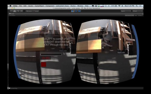
In parallel with the technical prototype, I’ve been working on a short comic to do just this. Since I’m a slow writer of fiction and an even slower comics artist, the comic is still unfinished. I’ve completed a script and I have three pages with finished art, only one of which (shown at the top of this section) I’ve also lettered and completed post-production. In this section, I’ll outline some of the discoveries from the prototype that have translated into the comic, shaping its story and presenting emotional and aesthetic issues for exploration. I’ll also show some in-progress pages to illustrate.

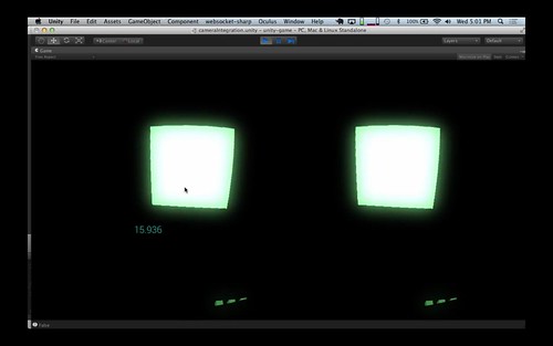
The voyeurism inherent in the supervised learning process is the first example of this. When I experienced it, I knew it was something that could be communicated through a character in my comic story. In fact, it helped create the character: someone who’s isolated, working a job in front of a computer without social interaction, but intrigued by the human stories that filter in through that computer interface, hungering to get drawn into them. This is a character who’s ripe for a mystery, an accidental detective. The finished and lettered page at the top of this section shows some of this in action. It uses actual screenshots of the prototype’s interface as part of a section of the story where the character explains his job and the system he uses to do it.

But where does such a character work? What world surrounds him, in what milieu does e-discovery take place? Well, thinking about the structure of my machine learning prototype, I realized that it was unlikely that current corporate law firms would do this work themselves. Instead, I imagined that this work would be done by the specialized IT firms I already encountered doing it (like Cataphora and Blackstone Discovery).

Firms with IT and machine learning expertise would have an easier time adding legal expertise by hiring a small group of lawyers than law firms would booting up sophisticated technical expertise from scratch. Imagine the sales pitch an IT firm with these services could offer to a big corporate client: “In addition to securely managing your messaging and hosting which we already do, now we can also provide defensive legal services that dramatically lower your costs in case of a lawsuit and reduce or eliminate your dependence on your super-expensive external law firm.” It’s a classic Clayton Christensen-esque case of disruption.

So, instead of large corporate law firms ever fully recovering from their circa–2008 collapse, I imagined that 2050 will see the rise of a new species of firm to replace them: hybrid legal-IT firms with heavy technological expertise in securely hosting large amounts of data and making it discoverable with machine learning. Today’s rooms full of paralegals and first-year associates will be replaced with tomorrow’s handful of sysadmins.

This is where my character works: at a tech company where a handful of people operate enormous data centers, instantly search and categorize entire corporate archives, and generally do the work previously done by thousands of prestigious and high-paid corporate lawyers.

And, as I mentioned in the last section, I don’t imagine that the services provided by such firms will stay limited to legal discovery. To paraphrase Chekov, if in the first act you have created way of surveilling employees, then in the following one you will surveil your own employees. In other words, once tools are built that use machine learning to detect messages that are related to any topic of inquiry, they’ll be used by managers of firms for preemptive prevention of legal issues, to capture internal business intelligence, and, eventually, to spy on their employees for trivial personal and political purposes.

Hence, in my comic’s story twists comes when it turns out that the firm’s client has used their tools inappropriately and when, inevitably, the firm itself is also using them to spy on my main character. While he enjoys his private voyeuristic view into the lives of others, someone else is using the same tools to look into his.

Finally, a brief note about the style of the comic’s art. As you can see from the pages included here, the comic itself includes screenshots of the prototype interface I created early in the process. In addition to acting as background research, the prototype design process also created much more realistic computer interfaces than you’d normally see in fiction.

Another small use of this that I enjoyed was the text of the emails included at the bottom of that finished page. I started with the Enron emails and then altered the text to fit the future world of my story. (See the larger version where you can read the details.) My small tribute to Martin Cuilla and all he did for this project.

The other thing I’ve been experimenting with in the art style is the use of 3D models. In both the exterior of the building and the server room above, I downloaded or made 3D models (the building was created out of a 3D model of a computer fan, which I thought appropriate for a futuristic data center), rendered them as outlines, and then glued them onto my comics pages where I integrated them (through collage and in-drawing) with hand-drawn figures and other images. This was both pragmatic – radically accelerating the drawing of detailed perspective scenes, which would have otherwise been painstaking to create by hand – and designed to make the technology of this future world feel slightly absent and undefined, a blank slate onto which we can project our expectations of the future. After all, isn’t this how sci-fi props and scenery usually acts?

Lawgorithm.com

Last and definitely least, as a lark I put together a website for the fictional firm described in the story (and whose branding adorned the interface prototype). I was quite proud of the domain I manage to secure for this purpose: lawgorithm.com. I also put an unreasonable amount of time into copying and satirizing the self-presentation style I imagined such a firm using: an unholy mashup of the pompous styling of corporate law firm websites like Skadden’s and the Apple-derivative style so common amongst contemporary tech startups. (I finished it off by throwing in a little Lorem Gibson for good measure.)

Despite a few masterpieces, satirical web design is an under-utilized medium. While comedic news sites like The Onion and The Daily Currant do look somewhat like the genre of news sites they skewer, they don’t take their visual mockery nearly as far as their textual mockery.

Posted in Art | Leave a comment

Research Proposal: Accounting for Anchoring Bias on User Labeling in Machine Learning Systems

(This post describes my proposed final research project for MAS.S62 Interactive Machine Learning at the MIT Media Lab.)

Description

Many interactive machine learning systems ask users to make sequences of judgments while training. For example, recommender systems often prompt the user to rate a series of items in a single session. Most systems assume that such judgments are stable over time and across varying conditions. However, there is extensive evidence from psychology that such judgments are subject to anchoring effects. First demonstrated by Kahneman and Taversky, “anchoring” describes how subjects make judgments by adjusting away from an initial piece of information rather than based on a consistent scale.

I propose to explore the intuition that users of interactive machine learning systems are subject to anchoring bias and that accounting for such bias can improve the results of interactive machine learning systems.

Specifically I propose to look for statistical evidence of anchoring bias in existing sequentially labeled data sets such as the Netflix Prize set of movie rankings. Secondarily, I propose to explore the design of a novel interactive machine learning system that takes anchoring bias as its starting point.

Motivation

Understanding the basis of user decision-making is essential to the design of effective interactive machine learning systems. Over the last 40 years, the psychology of judgment and decision-making has cataloged many cognitive biases that affect the kind of evaluations machine learning systems ask of their users. This body of research has yet to significantly impact the machine learning research community. Most machine learning systems treat the preferences and judgments expressed through user labels as consistent across time and varying conditions. If, instead, these labels are swayed by the users’ cognitive biases as the psychological literature suggests, measuring the effect of these biases and accounting for them in the design of our algorithms and interactive systems could make a significant impact on the quality of the results of machine learning applications.

Contribution Type

Understanding Users

Preliminary Bibliography

Tversky, Amos, and Daniel Kahneman. “Judgment under Uncertainty: Heuristics and Biases.” Science. no. 4157 (1974): 1124–1131.

Adomavicius, Gediminas, Jesse Bockstedt, Shawn Curley, and Jingjing Zhang. “Recommender systems, consumer preferences, and anchoring effects.” In RecSys 2011 Workshop on Human Decision Making in Recommender Systems, pp. 35–42. 2011.

Koren, Yehuda. “The bellkor solution to the netflix grand prize.” Netflix prize documentation (2009).

Cardie, Claire. “A cognitive bias approach to feature selection and weighting for case-based learners.” Machine Learning 41, no. 1 (2000): 85–116.

Cardie, Claire. “Integrating case-based learning and cognitive biases for machine learning of natural language.” J. Exp. Theor. Artif. Intell. 11, no. 3 (1999): 297–337.

Slovic, Paul. “The construction of preference.” American psychologist 50, no. 5 (1995): 364.

Carenini, Giuseppe, and David Poole. “Constructed preferences and value-focused thinking: implications for AI research on preference elicitation.” In AAAI–02 Workshop on Preferences in AI and CP: symbolic approaches, pp. 1–10. 2002.

Herbrich, Ralf, Thore Graepel, Peter Bollmann-Sdorra, and Klaus Obermayer. “Learning preference relations for information retrieval.” In ICML–98 Workshop: text categorization and machine learning, pp. 80–84. 1998.

Carterette, Ben, and Desislava Petkova. “Learning a ranking from pairwise preferences.” In Proceedings of the 29th annual international ACM SIGIR conference on Research and development in information retrieval, pp. 629–630. ACM, 2006.

Posted in Uncategorized | Leave a comment

Random Decision Forest’s Interaction Affordances

(This post responds to an assignment for MAS.S62 Interactive Machine Learning at the MIT Media Lab to analyze the input and output channels of a machine learning algorithm for their potential as affordances for interaction.)

When examined for its potential for interaction affordances, Random Decision Forests (Breiman 2001) distinguishes itself from other machine learning algorithms in its potential for transparency. Due to the nature of the algorithm, most Random Decision Forest implementations provide an extraordinary amount of information about the final state of the classifier and how it derived from the training data.

In this analysis, I discuss five outputs that are available from a Random Decision Forest and ways they could be used to provide interface or visualization options for a layman user of such a classifier. I also describe one input that could be similarly useful.

(For each output and input, I provide a link to the corresponding function in the OpenCV Random Decision Forest implementation. Other implementations should also provide similar access.)

Output: variable importance

In addition to returning the classification result, most Random Decision Forest implementations can also provide a measure of the importance that each variable in the feature vector played in the result. These importance scores are calculated by adding noise to each variable one-by-one and calculating the corresponding increase in the misclassification rate.

Presenting this data to the user in the form of a table, ranked list, or textual description could aid in feature selection and also help improve user understanding of the underlying data.

OpenCV’s implementation: CvRTrees::getVarImportance()

Output: proximity between any two samples

A trained Random Decision Forest can calculate the proximity between any two given samples in the training set. Proximity is calculated by comparing the number of trees where the two samples ended up in the same leaf node to the total number of trees in the ensemble.

This proximity data could be presented to the user of an interactive machine learning system in order to both improve the user’s understanding of the current state of training and to suggest additional labeled samples that would significantly improve classification. By iteratively calculating the proximities of each pair of samples in the training set (or a large subset of these) a system could produce a navigable visualization of the existing training samples that could significantly aid the user in identifying mis-labeled samples, crafting useful additional samples, and understanding the causes of the system’s predictions.

OpenCV’s implementation: CvRTrees::get_proximity()

Output: prediction confidence

Due to the ensemble structure of a Random Decision Forest, the classifier can calculate a confidence score for its predictions. The confidence score is calculated based on the proportion of decision trees in the forest that agreed with the winning classification for the given sample.

This confidence could be presented to a user in multiple different ways. A user could set a confidence threshold below which predictions should be ignored; the system could prompt the user for additional labeled samples whenever the confidence is too low; or the confidence could be reflected in the visual presentation of the prediction (size, color, etc) so that the user can take it into consideration.

OpenCV’s implementation: CvRTrees::predict_prob() (Note: OpenCV’s implementation only works on binary classification problems.)

Output: individual decision trees

Since Random Decision Forest is usually implemented on top of a simpler decision tree classifier, many implementations provide direct access to the individual decision trees that made up the ensemble.

With access to the individual decision trees, an application could provide the user with a comprehensive visualization of the Forest’s operation including showing the error rates for the individual trees and the variable on which each tree made each split. This visualization could aid in feature selection and in-depth evaluation and exploration of the quality of the training set.

OpenCV’s implementation: CvRTrees::get_tree()

OUTPUT: calculate training error

Since Random Decision Forests store each of their training samples internally as they construct their decision trees, unlike many other machine learning methods, they can evaluate their own training error after the completion of training. On classification problems, this error is calculated as the percentage of mis-classified training samples, in regression problems it is the mean square of the errors.

This error metric is simple enough that it could be shown to an end-user as a basic form of feedback on the current state of training quality. However, without other metrics, this would create the danger of encouraging the user to work towards overfitting the training sample.

CvRTrees::get_train_error() (Note: OpenCV’s implementation only works on classification problems.)

Input: Max number of trees in the forest

The most important input for a user to a Random Decision Forest is the maximum number of trees allowed in the forest. Up to the point of diminishing returns, this is essentially a proxy for the trade-off between training time and result quality.

This could be presented to the user as a slider, allowing them to choose faster training or better results throughout the process of interactively improving a classifier.

OpenCV’s implementation: CvDTreeParams::set_max_depth()

Posted in Uncategorized | 2 Comments

GestuRe: An Interactive Machine Learning System for Recognizing Hand Gestures

(This post describes a project I completed for MAS.S62 Interactive Machine Learning at the MIT Media Lab. The assignment was to create a simple interactive machine learning system that gave the user visibility into the learning algorithm.)

GestuRe is a mixed-initiative interactive machine learning system for recognizing hand gestures. It attempts to give the user visibility into the classifier’s prediction confidence and control of the conditions under which the system actively requests labeled gestures when its predictions are uncertain.

Training object or gesture recognition systems is often a tedious and uncertain process. The slow loop from gathering images to training a model to testing the classifier separates the process of selecting training samples from the situation in which the system is actually used.

In building such systems, I’ve frequently been frustrated by the inability to add corrective samples at the moment a mistaken classification occurs. I’ve also struggled to feel confident in the state of the classifier at any point in the training process. This system attempts to address both problems, producing a recognition system that is fluid to train and whose reliability can be understood and improved.

GestuRe creates a feature vector from an input image from a live camera using Histogram of Oriented Gradients [Dalal & Triggs 2005]. The user selects a class label for these input images and the system then trains a Support Vector Machine-based classifier on these labeled samples [Vapnik 1995].

The system then displays to the user the prediction likelihood for each submitted class as well as the current classification. Further, the system shows the user all of the training samples captured for each class. Note: everywhere in the interface that the system presents a class to the user, it uses one of the training images to represent that class rather than text. This makes the interface easier to comprehend when the user’s attention is split between its output and their own image in the live video feed.

The user submits labeled samples in two phases. First they establish the classes by submitting a series of images for each distinct gesture they want the system to detect. Then, after initial training, the system begins classifying the live gestures presented by the user and displaying its results. In this phase, whenever the system’s confidence in its top prediction (as represented by the gap in probability between the most likely class and the second most likely) falls below a user-defined threshold, the system prompts the user for additional training samples.

This prompt consists of a modal interface which presents the user with a snapshot of the gesture that caused the low confidence prediction. Alongside this snapshot, the system presents a series of images representing each known class. The user selects the correct class, creating a new labeled sample and the system retrains the classifier, hopefully increasing prediction confidence.

This modal active learning mode places high demands on the user, risking the danger of the user feeling like they’re being treated as an oracle. To alleviate this feeling, GestuRe gives the user a series of parameters to control the conditions under which it prompts them for a labeled sample. First amongst these is a “confidence threshold”, which determines the minimum probability gap between the top two classes that will trigger a request for a label. A lower confidence threshold results in fewer requests but more incorrect predictions. A high threshold results in more persistent requests for labels but the eventual training of a higher quality classifier.

Second, the user can control how long the system will endure low-confidence predictions before requesting a sample. Since prediction probabilities fluctuate rapidly with live video input, the confidence threshold alone would trigger active learning too frequently, even on a well-trained classifier, simply do to the variations in the video input and, especially, the ambiguous states as the user moves their hands between well-defined gestures. The “time before ask” slider allows the user to determine the number of sequential below-threshold predictions before the system will prompt for a labeled sample. The system also displays a progress bar so the user can get a sense for when the system’s predictions are below the confidence threshold and how close its coming to prompting for more labeled samples.

Finally, the system allows the user to turn active training off altogether. This mode is especially useful when adding a new gesture to the system by submitting a batch of samples. Also, it allows the user to experience the current quality of the system without being interrupted for new labels.

GestuRe could be further improved in two ways. First, it would help to show the user a visualization of the histogram of oriented gradients representation that is actually used in classification. This would help them identify noisy scenes, variable hand position, and other factors that were contributing to low classification confidence. Secondly, it would help to identify which classes needed additional clarifying samples. Possibly performing offline cross-validation on the saved samples in the background could help determine if the model had lower accuracy or precision for any particular class.

Finally, I look forward to testing GestuRe on other types of recognition problems beyond hand gestures. In addition to my past work with object recognition mentioned above, during development I discovered that GestuRe can be used to classify facial expressions as well as this video, using an early version of the interface, demonstrates:

Interactive Machine Learning with Funny Faces from Greg Borenstein on Vimeo.

I implemented GestuRe using the OpenCV computer vision library, libsvm, and the Processing creative coding framework. In particular, I used OpenCV for Processing, my own OpenCV wrapper library, as well as PSVM, my libsvm wrapper. (While OpenCV includes implementations of a series of machine-learning algorithms, its SVM implementation is based on an older version of libsvm which performs significantly worse with the same settings and data.)

GestuRe’s source code is available on Github here: atduskgreg/gestuRe.

Posted in Art | Leave a comment

Case and Molly: A Game Inspired by Neuromancer

Case and Molly First Playtest from Greg Borenstein on Vimeo.

“Case and Molly” is a prototype for a game inspired by William Gibson’s Neuromancer. It’s about the coordination between the virtual and the physical, between “cyberspace” and “meat”.

Neuromancer presents a future containing two aesthetically opposed technological visions. The first is represented by Case, the cyberspace jockey hooked on navigating the abstract information spaces of The Matrix. The second is embodied by Molly, an augmented mercenary who uses physical prowess and weaponized body modifications to hurt people and break-in places.

In order to execute the heists that make up most of Neuromancer’s plot, Case and Molly must work together, coordinating his digital intrusions with her physical breakings-and-enterings. During these heists they are limited to an extremely asymmetrical form of communication. Case can access Molly’s complete sensorium, but can only communicate a single bit of information to her.

On reading Neuromancer today, this dynamic feels all too familiar. We constantly navigate the tension between the physical and the digital in a state of continuous partial attention. We try to walk down the street while sending text messages or looking up GPS directions. We mix focused work with a stream of instant message and social media conversations. We dive into the sudden and remote intimacy of seeing a family member’s face appear on FaceTime or Google Hangout.

(Note: “Case and Molly” is not a commercial project. It is a game design meant to explore a set of interaction ideas. It was produced as a project for an MIT Media Lab class Science Fiction to Science Fabrication. The code is available under a Creative Commons Attribution-NonCommercial-ShareAlike 3.0 license for educational purposes. Please do not use it to violate William Gibson’s intellectual property.)

Gameplay

“Case and Molly” uses the mechanics and aesthetics of Neuromancer’s account of cyberspace/meatspace coordination to explore this dynamic. It’s a game for two people: “Case” and “Molly”. Together and under time pressure they must navigate Molly through a physical space using information that is only available to Case. Case can see Molly’s point of view in 3D but can only communicate to her by flipping a single bit: a screen that’s either red or green.

Case and Molly headset view

Case is embedded in today’s best equivalent of Gibsonian cyberspace: an Oculus Rift VR unit. He oscillates between seeing Molly’s point of view and playing an abstract geometric puzzle game.

Case and Molly: stereo phone rig

Molly carries today’s version of a mobile “SimStim unit” for broadcasting her point of view and “a readout chipped into her optic nerve”: three smartphones. Two of the phones act as a pair of stereo cameras, streaming her point of view back to Case in 3D. The third phone (not shown here) substitutes for her heads-up display, showing the game clock and a single bit of information from Case.

Case and Molly: Molly turn

The game proceeds in alternating turns. During a Molly turn, Case sees Molly’s point of view in 3D, overlaid with a series of turn-by-turn instructions for where she needs to go. He can toggle the color of her “readout” display between red and green by clicking the mouse. He can also hear her voice. Within 30 seconds, Molly attempts to advance as far as possible, prompting Case for a single bit of direction over the voice connection. Before the end of that 30 second period, Molly has to stop at a safe point, prompting Case to type in the number of a room along the way. If time runs out before Case enters a room number, they lose. When Case enters a room number, Molly stays put and they enter a Case turn.

Case and Molly: Case turn

During his turn, Case is thrust into an abstract informational puzzle that stands in for the world of Cyberspace. In this prototype, the puzzle consists of a series of cubes arranged in 3D space. When clicked, each cube blinks a fixed number of times. Case’s task is to sort the cubes by the number of blinks within 60 seconds. He can cycle through them and look around by turning his head. If he completes the puzzle within 60 seconds they return to a Molly turn and continue towards the objective. If not, they lose.

At the top of this post is a video showing a run where Case and Molly make it through a Molly turn and a Case turn before failing on the second Molly turn.

Play Testing and Similarities and Differences from Neuromancer

In play testing the game and prototyping its constituent technology I found ways in which the experience resonated with Gibson’s account and others in which it radically diverged.

One of the strongest resonances was the dissonance between the virtual reality experience and being thrust into someone else’s point of view. In Neuromancer, Gibson describes Case’s first experience of “switching” into Molly’s subjective experience, as broadcast by a newly installed “SimStim” unit:

The abrupt jolt into other flesh. Matrix gone, a wave of sound and color…For a few frightened seconds he fought helplessly to control her body. Then he willed himself into passivity, became the passenger behind her eyes.

This dual description of sensory richness and panicked helplessness closely matches what it feels like to see someone else’s point of view in 3D. In Molly mode, the game takes the view from each of two iPhones aligned into a stereo pair and streams them into each eye of the the Oculus Rift. The resulting 3D illusion is surprisingly effective. When I first got it working, I had a lab mate carry the pair of iPhones around, placing me into different points of view. I found myself gripping the arms of my chair, white-knuckled as he flew the camera over furniture and through obstacles around the room. In conventional VR applications, the Oculus works by head tracking, making the motions of your head control the direction of a pair of cameras within the virtual scene. Losing that control, having your head turned for you, and having your actual head movements do nothing is extremely disorienting.

Gibson also describes the intimacy of this kind of link, as in this exchange where Molly speaks aloud to case while he rides along with her sensorium:

“How you doing, Case?” He heard the words and felt her form them. She slid a hand into her jacket, a fingertip circling a nipple under warm silk. The sensation made him catch his breath. She laughed. But the link was one-way. He had no way to reply.

While it’s not nearly as intimate as touch, the audio that streamed from “Molly”’s phone rig to “Case” in the game provided an echo of this same experience. Since Molly holds the phones closely and moves through a crowded public space, she speaks in a whisper, which stays close in Case’s ears even as she moves ever further away in space.

Even in simpler forms, this Case-Molly coordination can be interesting. Here’s a video from an early prototype where we try to coordinate the selection of a book using only the live camera feed and the single red/green bit.

Case and Molly: First Coordination Prototype from Greg Borenstein on Vimeo.

One major aspect of the experience that diverged from Gibson’s vision is the experience of “cyberspace”. The essence of this classic idea is that visualizing complex data in immersive graphical form makes it easier to navigate. Here’s Gibson’s classic definition:

Cyberspace. A consensual hallucination experienced daily by billions of legitimate operators…A graphic representation of data abstracted from the banks of every computer in the human system. Unthinkable complexity. Lines of light ranged in the non space of the mind, clusters and constellations of data. Like city lights, receding"

Throughout Neuromancer, Gibson emphasizes the fluency achieved by Case and other cyberspace jockeys, the flow state enabled by their spacial navigation of the Matrix. Here’s a passage from the first heist:

He flipped back. His program had reached the fifth gate. He watched as his icebreaker strobed and shifted in front of him, only faintly aware of his hands playing across the deck, making minor adjustments. Translucent planes of color shuffled like a trick deck. Take a card, he thought, any card. The gate blurred past. He laughed. The Sense/Net ice had accepted his entry as a routine transfer from the consortium’s Los Angeles complex. He was inside.

My experience of playing as Case in the game could not have been more opposed to this. Rather than a smooth flow state, the virtual reality interface and the rapid switches to and from Molly’s POV left me cognitively overwhelmed. The first time we successfully completed a Molly turn, I found I couldn’t solve the puzzle because I’d essentially lost the ability to count. Even though I’d designed the puzzle and played it dozens of times in the course of implementing it, I failed because I couldn’t stay focused enough to retain the number of blinks of each cube and where they should fit in the sorting. This effect was way worse than the common distractions of email, Twitter, texts, and IM many of us live with in today’s real computing environments.

Further, using a mouse and a keyboard while wearing a VR helmet is surprisingly challenging itself. Even though I am a very experienced touch-typist and am quite confident using a computer trackpad, I found that when presented with contradictory information about what was in front of me by the VR display, I struggled with basic input tasks like keeping my fingers on the right keys and mousing confidently.

Here you can see a video an early run where I lost the Case puzzle because of these difficulties:

Case and Molly prototype: first Case fail from Greg Borenstein on Vimeo.

Technical Implementation

Case and Molly game diagram

Lacking an Ono Sendai and a mobile SimStim unit, I built this Case and Molly prototype with a hodgepodge of contemporary technologies. Airbeam Pro was essential for the video streaming. I ran their iOS app on both iPhones which turned each one into an IP camera. I then ran their desktop client which captured the feeds from both cameras and published them to Syphon, an amazingly-useful OSX utility for sharing GPU memory across multiple applications for synced real time graphics. I then used Syphon’s plugin for the Unity3D game engine to display the video feeds inside the game.

I built the game logic for both the Case and Molly modes in Unity using the standard Oculus Rift integration plugin. The only clever element involved was placing the Plane displaying the Syphon texture from each separate camera into its own Layer within Unity so the left and right cameras could be set to not see the overlapping layer from the other eye.

To communicate back from Case to Molly, I used the Websockets-Sharp plugin for Unity to send messages to a Node.js server running on Nodejitsu, the only Node host I could find that supported websockets rather than just socket.io. My Node app then broadcasts JSON with the button state (i.e. whether Case is sending a “red” or “green” message) as well as the game clock to a static web page on a third phone, which Molly also carries.

The code for all of this can be found here: case-and-molly on Github.

Special thanks to Kate Tibbetts for playing Molly to my Case throughout the building of this game and for her endlessly useful feedback.

Posted in Art | 7 Comments

Introducing 2H2K: Previz for the Second Half of the 21st Century

powers_at_night_mockup

I’m excited to announce a new collaborative project with my friend, John Powers, called “2H2K”. 2H2K brings together our shared interests in science fiction, urbanism, futurism, cinema, and visual effects into a multimedia art project that imagines what life could be like in the second half of the 21st century.

We’ve structured the project to proceed as if we were developing and doing the pre-production for an imagined sci-fi movie. We’re using fiction, drawing, sculpture, collage, comics, conversation, technical research, speculative design, and interactive technology to explore the cultural and human effects of the big changes coming to our world in the 21st century. As John set out in his introduction to the project, these changes include slowing population growth, mass migration of people into cities, and technological transformations in the value and organization of labor.

John and I have been discussing the project and working on it in preliminary forms for the past six months. This week, John began posting the first of the planned 12 short stories he’s writing to kick us off. They’re organized around each of the twelve months of the year 2050. Read the first three here (along with John’s introductions to them):

In this post, I’ll provide some background on my own interests that lead me to the project, how I came to approach John about it, and some of the areas that I’ve been thinking about so far.

From Star Wars to Jedi

My earliest memory of television comes from when I was three. The image turns out to be part of From Star Wars to Jedi: The Making of a Saga, a television documentary that aired in the manic run-up to the release of Return of the Jedi.

The memory starts with a shot from Empire. It’s a shot of an Imperial Walker in the snow. Everything about the shot looks perfect, just like the movie. The Walker is frozen mid-stride on a snowy plain in front of far away jagged hills under a pale sky of puffy clouds. And then, suddenly, a huge man emerges from beneath the horizon. He’s bigger than the Walker. Much bigger. He dwarfs it. After a moment’s consideration he reaches in to adjust it.

Phil Tippet animating an Imperial Walker

Something about this image hit me hard. In remembering it since two ideas have wrapped themselves around the memory. The first one is about scale. The magical transporting images of these movies were made out of stuff. Small stuff. Bits of real things that were made and manipulated by people. They’d formed these bits into a model of another world that they could look down into and change and work.

The second idea was about people. My god, this was someone’s job! To get in there amongst the stuff and get your hands on it. They got to live in these unfinished worlds with all their raw edges. They got to see them while they were still part of the real world, before the camera came in with its mercilessly abstracting rectangle and hid all the supports and jigs and armatures and mechanisms, leaving just a stump, dead and ready for display.

The man in that image, of course, was Phil Tippet, the brilliant stop motion artist responsible for much of the magic in the original trilogy. His job, it turned out, was called “visual effects”. That moment kicked off a life-long love of visual effects for me – a love not just of the effects the field could achieve, but of that always fragmentary world of objects, of all of those supports and mechanisms, that lay behind it.

More even than visual effects movies themselves, I love the artifacts of them behind-the-scenes and in-progress: plates with partially-rendered creatures, bits of sets bristling with equipment, un-chromakeyed green screen, etc. This is “world building” not just as an act of imagination, but as the palpable pushing of atoms and bits.

Alien set favela

Approaching John

With this start (and an early adulthood that included constant reading of science fiction, an art education studying under an unclassifiable post-minimalist painter, and a spate covering urban planning in Portland), I may have been the single perfect reader for John Powers’ essay, Star Wars: A New Heap. The piece hit me like a lightning bolt. It combined the politics of urbanism, the philosophy of minimalist art, and the material texture of Star Wars’ visual effects into a coherent aesthetic and political world view. For me, it provided the unique pleasure only available when the external world conspires to combine multiple of your own seemingly disparate interests in a way that reveals their interrelations. John, via Robert Smithson, had put a name on what drew me to behind-the-scenes images: the power of the “discrete stage”.

When I moved to New York years later, I sought John out and we became friends. Earlier this year I came to him with a proposal for a collaborative project. I’d been thinking about one of the challenges of a discrete stage/behind-the-scenes aesthetic: you need a final artifact to head towards, a show who’s scenes you can be behind.

In searching for a sci-fi story to tell, I’d struck on an image: one of John’s sculptures, scaled up to the size of a building and towering over the New York skyline (as in the collage at the top of this section). Once I imagined it, my head started filling up with questions. Was it a building? If so what had happened to the world that had pushed architecture to such radical extremes? What if it wasn’t a building? What other kind of technological process or cultural entity could have made it and for what purpose? Was it even physical? What if it wasn’t present at all, but some kind of Modernist augmented reality fantasy meant to spice up a post-Thingpunk world?

powers_in_city_mockup

I didn’t have answers to these questions, but they felt like speculations that could generate stories so I decided to bring the idea to John. I showed him the image and asked him: what would make the world like this?

John had already shown himself to be a handy (re)writer of science fiction with his re-invention of the unfortunate Ridley Scott Alien prequel, Prometheus (re)Bound. And we’d had some really interesting conversations about technology and aesthetics at Robotlife a meetup organized by Joanne McNeil and Molly Steenson in response to the New Aesthetic.

We started the process with a few wide-ranging conversations about the future. We talked about climate change, population growth, the explosion of cities, changes in the lives of artists, the future of technologies like cameras, 3D printing, robotics, and artificial intelligence. As John set off to write stories, I started bringing together background research, design speculation, drawings, and sketches. I found myself imagining the future through sketches for products, imagined Wikipedia articles, and dreams of images made by impossible cameras. As the project continues I’ll be posting artifacts of those in the forms of drawings, 3D models, comics, collages, prototypes, etc.

These artifacts will sometimes illustrate John’s stories, sometimes explore ideas from our conversations that didn’t make it into them directly, and sometimes expand our imagined future beyond them. They’re an attempt to do science fiction with objects, images, text, and code.

Posted in Art | Leave a comment

Announcing OpenCV for Processing

I’m proud to announce the release of OpenCV for Processing, a computer vision library for Processing based on OpenCV.

You can download it here.

The goal of the library is to make it incredibly easy to get started with computer vision, to make it easy to experiment with the most common computer vision tools, and to make the full power of OpenCV’s API available to more advanced users. OpenCV for Processing is based on the official OpenCV Java bindings. Therefore, in addition to a suite of friendly functions for all the basics, you can also do anything that OpenCV can do.

The library ships with 20+ examples demonstrating its use for everything from face detection:

Screen Shot 2013-04-08 at 1.22.18 PM

(Code here: FaceDetection.pde)

to contour finding:

contours with polygon approximations

(Code here: FindContours.pde)

to background subtraction:

Background Subtraction

(Code here: BackgroundSubtraction.pde)

to depth from stereo:

Screen Shot 2013-04-12 at 2.27.30 AM

(Code here: DepthFromStereo.pde)

and AR marker detection:

Screen Shot 2013-04-12 at 12.20.17 AM

(Code here: MarkerDetection.pde)

So far, OpenCV for Processing has been tested on 64-bit Mac OSX (Lion and Mountain Lion, specifically) as well as 32-bit Windows 7 and 64- and 32-bit Linux (thanks Arturo Castro). Android support hopefully coming soon (pull requests welcome).

It’s already been used in the software for Kinograph, Matt Epler’s DIY film scanner.

OpenCV for Processing was made possible by the generous support of the Processing Foundation and O’Reilly Media. I’ve received invaluable guidance along the way from Dan Shiffman, Andres Colubri, Kyle McDonald, and Golan Levin. A lot of the library’s style was inspired by Kyle McDonald’s excellent ofxCv.

A Book!

While the documentation for OpenCV for Processing may look slim at the moment, I’m working on remedying that in a big way. I’m currently under contract with O’Reilly to write an introduction to computer vision, which will act as comprehensive documentation for OpenCV for Processing as well as a general introduction to the field of computer vision.

I’ve already begun work on the book and I’m really excited about it. It will be available through Atlas, O’Reilly’s new online learning environment. As befits a book about computer vision, it’ll make extensive use of multimedia and interaction. I’m also proud to announce that I’ve worked with O’Reilly to ensure that the book will be Creative Commons licensed from its inception. It will live on Github and accept contributions and corrections from the community. Watch this repo for details.

Why a New OpenCV Library for Processing?

Previously, there have been two OpenCV libraries for Processing, both of them French in origin.

There’s the venerable Ubaa.net library by Atelier Hypermedia. This library was based on OpenCV 1.0 and hasn’t been updated in quite awhile. It never made the jump to Processing 2.0.

There’s also JavacvPro, which is based on JavaCV, a widely used Java wrapper for OpenCV. While I’ve used JavacvPro successfully in projects before, it has a number of shortcomings. It requires its user to build OpenCV from source, which is a major stumbling block, especially for the typical Processing user. OpenCV for Processing, on the other hand, bundles OpenCV so it installs like any other Processing library. While JavacvPro uses a relatively recent version of OpenCV, it is written in an older style, using OpenCV classes that require manual memory management. The result is that JavacvPro leaks memory and has some other erratic runtime behaviors. OpenCV for Processing uses the official Java API, which only provides access to modern memory-managed OpenCV structures. Hence, it benefits from the memory correctness and efficiency of the OpenCV developers (who are much smarter than I could ever hope to be) and doesn’t have (known) memory leaks.

Finally, JavacvPro depends on JavaCV, which slows the rate at which it keeps up with changes in the OpenCV API, and also makes it impossible for end-users to benefit from the huge amount of OpenCV documentation and support available online. Users of OpenCV for Processing can simply open the official OpenCV javadocs and start calling functions.

Caveats and Concerns

UPDATE: This section describes a problem that was present when this library was released in July of 2013. As of Processing 2.0.3 (circa Fall 2013) this problem is fixed and OpenCV for Processing should work fine with any subsequent version of Processing.

OpenCV for Processing is currently at version 0.4. It most certainly has bugs and could use serious improvement. Please find these bugs and tell me about them!

The most significant known problem is, thankfully, a temporary one that most affects users on Macs with Retina displays attempting to process video.

In the official release of Processing 2.0, the Capture and Movie libraries don’t provide access to the pixels[] array in the OpenGL-based renderers (P2D and P3D). This is a temporary stop-gap condition that will be fixed in the next release of Processing (hopefully coming in the next few weeks).

On non-retina machines, you can fix the problem by switching to the JAVA2D renderer. However, that renderer doesn’t work on Retina Macs. If you’re on a Retina Mac, you have two options: you can build Processing from source or download the older 2.0b8 version.

Hopefully all of this will be fixed soon due to Andres’s amazingness and we can forget about it.

Enjoy playing with OpenCV for Processing and be sure to show me what you build!

Posted in Art | 128 Comments

OOO and OOP

Graham Harman has always denied any deep connection between his Object-Oriented Philosophy and Object-Oriented Programming, from which he borrowed the name. Initially, fellow OOO-er Ian Bogost even resisted the use of “object-oriented” as confusing due to the failure of the computer science sense of the term to “mesh” with the philosophical one.

But, the more I’ve read of Harman and other OOO thinkers, the more I disagree with Bogost. While Harman’s objects are not identical to those that are familiar to programmers, the relationship goes well beyond shared terminology. They are deeply enmeshed, both conceptually and etymologically.

In this post, I’ll try to tease out some of these connections, by looking briefly at two key terms in Harman’s philosophy: “black boxes” and “withdrawal”.

Black Boxes

The term “black box” plays a key role in Harman’s Prince of Networks. In Prince of Networks, Harman reads French sociologist Bruno Latour’s oeuvre in order to spell out the metaphysical system at play within it. He then goes on to define his own Object-Oriented Philosophy by building on – and diverging from – Latour’s ideas.

Latour defines the term “black box” thusly (as cited by Harman in Prince of Networks):

A black box is any actant so firmly established that we are able to take its interior for granted. The internal properties of the black box do not count as long as we are concerned only with its input and output.

Latour deploys the term to solve a key problem in his Actor Network Theory: how can we talk about individual members of the Network when we know that, if we looked more closely, they’d teem with other actants and their relations. We can only consider an individual actant in itself by hiding the other actants that make it up within a “black box” abstraction that reveals only those actants’ collective effects, properties, and relations.

In the sciences, the term “black box” seems to have first appeared in the work of German mathematician Wilhelm Cauer, but it was made famous by Norbert Weiner, the legendary mathematician who created the field of Cybernetics. In Cybernetics: or Control and Communication in the Animal and the Machine (1948), Weiner defined a “black box” as

a piece of apparatus which performs a definite operation on the present and past of the input potential, but for which we do not necessarily have any information of the structure by which this operation is performed.

(Latour explicitly mentions this cybernetic origin when he introduces the term in Science in Action.)

This idea has had many applications in engineering and programming from code breaking to electronics to the design of programs in the intervening 65 years.

In its most common programming usage, the “black box” stands for the principle of abstraction: the goal that individual components should be built with as few assumptions as possible about the wider system so that they can be reused in different situations without needing to be changed.

Latour’s use of “black box” is perfectly resonant with its mathematical and programming usage. As is Harman’s.

Harman adopted the term from Latour to battle what he calls the “undermining” instinct: the tendency to reduce an object to its components. An underminer would look at the laptop on which I’m composing this blog post and say: well the laptop is really just a collection of aluminum, glass, and silicon components. And those components are really just collections of atoms. And the atoms are really just collections of sub-atomic particles. And the sub-atomic particles are really just probability waves in a vacuum.

Harman deploys the black box in defense against this, essentially nihilistic, gesture. The black box allows Harman to think about objects as unitary wholes, with their own effects and relations distinct from those of their components, even while knowing that they contain complex networks of other objects inside of them. Again from Prince of Networks:

The black box replaces traditional substance…while traditional substances are one, black boxes are many – we simply treat them as one, as long as they remain solid in our midst. Like Heidegger’s tools, a black box allows us to forget the massive network of alliances of which it is composed, as long as it functions smoothly.

The distinction between Harman’s use of “black box” and Weiner’s is subtle. For Harman, an object has effects and relations in excess of those of its components. For Weiner, a black box represents a (frequently voluntary) boundary of knowledge. How an object transforms its input into its output may be completely determined by the objects inside its black box, but we either can’t, or choose not, to know exactly how they contribute to that process. However, in the practice of programming our black box abstractions always do have effects beyond simply hiding their internals. The abstractions we inherit and choose to create play a major role in the social and technical evolution of our systems, helping to determine the boundaries between different pieces of software, teams and companies, and even pieces of hardware infrastructure. They certainly have effects and relations distinct from their components.

Withdrawal

“Withdrawal” is an even more interesting example of this resonance. Withdrawal is a core concept in Harman’s thought. It is what gives objects their continuity over time and their persistence despite change.

For Harman, real objects withdraw. There’s always more to them than the qualities and relations we observe them to posses. Harman calls the part of the object we can observe and relate to the “sensual object” in distinction to this “withdrawn object”.

In Prince of Networks, Harman introduces withdrawal in order to solve a problem he saw in Latour with the continuity of objects. For Latour, an object is nothing more than its relations. Objects (or “actants” in Latour’s terminology) sit in a network of other objects, acting as their supporters, components, evidence, masters, associates, etc. They are entirely determined by these relations. However, Harman observed that if any of these relations changed (which they obviously do over time) then, in this understanding, the object must cease to exist and become a different object (objects being nothing more than their relations).

For Latour, the demitasse out of which I drink my espresso becomes a fundamentally different object when the barista fills it, another different one when she passes it to me, and a third, fourth, fifth, and sixth with each sip I take from it. Six completely different objects.

Harman observed that this point of view makes it hard to think about change. There’s no object that persists through this series of alterations, undergoing changes. He introduced withdrawal to explain change. The withdrawn object is what persists even as its qualities and relations change.

How does this relate to Object-Oriented Programming? Let me explain through some example code.

In Ruby, when you create a new object, it has an object_id:

o = Object.new
puts o.object_id
#=> 70152737816360

This object_id is just a number. The Ruby environment uses it to remember where the object is located in memory, but it is independent from the particulars of the object itself.

You can add data to the object by defining instance variables on it:

o.instance_variable_set("@name", "spot")

and its object_id won’t change:

puts o.object_id
#=> 70152737816360

even though the data is now there:

puts o.instance_variable_get("@name")
#=> "spot"

You can also remove data without affecting the object_id:

o.send(:remove_instance_variable, "@name") 
puts o.object_id
#=> 70152737816360
o.instance_variable_get("@name")
#=> nil 

And, of course, the same thing holds for adding and removing methods:

def o.cat!
    puts "meow"
end

def o.dog!
    puts "arf"
end

o.cat!
#=> "meow"
o.dog!
#=> "arf"
puts o.object_id # no change
#=> 70152737816360 

class << o
    remove_method(:dog!)
end

o.dog!
#=> NoMethodError: undefined method `dog!'...
puts o.object_id # no change
#=> 70152737816360 

In a very real way, a Ruby object’s id is the essence of the object; it’s how the system knows where to find the object in memory. If the object_id was somehow removed or changed the object would be lost. On the other hand, the object_id is utterly uninteresting. It doesn’t tell us anything about the object’s data or methods – the parts of the object that interact with other objects and that we spend most of our time thinking about and manipulating.1

This is profoundly parallel with Harman’s idea of withdrawal. The object_id is an analogue for Harman’s withdrawn object while the methods and data make up the “sensual object” we perceive and to which we (and other objects) relate.

One common misinterpretation of Harman’s position is to imagine that the withdrawn portion of the object is always its most important part, even its “soul”. However, as spelled out in The Quadruple Object, Harman’s system sees objects as having a four-fold structure. And, in some regards, the withdrawn object is the least interesting of the four. Just like the Ruby object_id, even though the withdrawn object is mysterious and inaccessible, it doesn’t determine the object’s qualities and relations, which are frequently what we’re most interested in.

Politics and the Fear of Technical Associations

There are many additional facets of Object-Oriented Philosophy that have similarly interesting relations to Object-Oriented Programming. There’s probably a dissertation-scale study to be done just in comparing Harman’s thought with that of Alan Kay, the legendary computer scientist who coined the phrase “object-oriented programming”. Such a study could serve as an intellectual history tracing the movement of these ideas back and forth between technical and philosophical disciplines, provide a source of additional philosophical material unearthed by computer scientists, and introduce a new axis for understanding the work of computer scientists by unpacking their various philosophical positions.

However, I find it very unlikely that such work will be done in a philosophy department any time soon – and not just because of the difficulties involved in mastering both the computer science and philosophical technicalities involved (after all, Harman’s work reading Latour as a philosopher required a similar engagement with the sociological specificities of that oeuvre).

One of the chief criticisms leveled against OOO is political, specifically that it fails to provide a basis for radical political action against the state. Alex Galloway has been maybe the most-prominent spokesman for this position, accusing Harman of “depoliticization and neutralization” and arguing that politics must precede other forms of thought: “to be political means that you have to *start* from the position of incompatibility with the state”.

Galloway blames these political failings exactly on OOO’s technical heritage, arguing that “OOO is politically naive because it parrots a kind of postfordist/cybernetic thought”. Essentially saying that OOO’s roots in programming make it complicit with “digital capitalism”.

Harman, and other OOO thinkers, have responded vigorously to this critique (see Bryant and Donkey Hottie, amongst many others). In addition to criticizing the weak ties that Galloway sloppily used to bind OOO to “digital capitalism”, the OOOers have, validly questioned Galloway’s basic premise that politics must always precede and determine other forms of philosophical inquiry.

Despite this vigorous defense, these kinds of attacks have left OOO with a lasting fear of an over-close association with technical fields like computer science and programming. This is a serious shame as it obscures a significant part of OOO’s heritage, prevents what could be a powerfully productive interdisciplinary collaboration, and (maybe worst) leaves OOO’s critics as the only voices defining this connection.

  1. The class of a Ruby object is also unchangeable, but this feels like a way that Ruby is a bit more “class-oriented” than “object-oriented”. Relatedly, one of Bogost’s objections to the philosophical use of object-oriented was that computational objects “describe a pattern, not a thing.” I think Bogost, here, mistakes classes, which are patterns for objects with the instantiated objects themselves, a common and understandable slippage since in most mainstream object-oriented languages, like Ruby, programmers spend much more of their time thinking about and writing classes than they do manipulating individual objects as I’ve been doing in this example code.)
Posted in Opinion | Leave a comment

iPads in Space: Star Trek’s Internet-Free Future

“A good science fiction story should be able to predict not the automobile but the traffic jam” – Fredrik Pohl

I’ve been watching Star Trek: Deep Space Nine recently for the first time in 20 years. I have vague memories of the pilot from its original airing when I was in middle school, mostly of marveling at its digital effects, which were shocking to see on TV in that era. This time around, however, what hit me was something different: the characters on the show are constantly handing each other iPads.

Here’s a characteristic example, some anonymous yellow shirt giving Worf a report:

Giving someone a document

The iPads seem to be the method of choice for delivering reports, important documents, and programs.

In another episode, Little Green Men, O’Brien and Bashir give a young Ferengi heading off to Star Fleet Academy a gift: “It’s not just a guidebook! It’s a completely interactive program detailing Earth’s customs, culture, history, geography.”

A gift of a guidebook to Earth

And this iPad-handing wasn’t just a DS9 phenomenon. It happened across the entire Star Trek franchise at that time. Here’s an example from the 1996 movie Star Trek: First Contact. The overworked Picard’s desk is overflowing with them.

After doing some research, I learned that in the Star Trek universe, these things are called PADDs for Personal Access Display Device. And they’ve actually been around since the original series episode The Man Trap.

Obviously, PADDs are physically very similar to iPads. At first, they seem like another example of Star Trek’s track record as a predictor of futuristic devices. The most famous example of this is the communicators from the original series, which Martin Cooper, inventor of the mobile phone, cited as an inspiration.

But, as I watched the PADDs circulate around the show, I slowly realize that they’re not actually used like iPads at all. In fact, they’re more like fancy pieces of paper. Individual PADDs correspond to specific documents like the Earth guidebook shown above. To give someone a document, people carry PADDs around and then leave them with the new owner of the document.

Further, the existence of PADDs and incredibly powerful computers seems to have in no way transformed the way citizens of the 24th century consume or distribute culture. A Deep Space Nine episode, The Visitor, centers on Jake Sisko’s career as an author. Here’s what his books look like:

Books on Deep Space Nine

If the books are digital documents with digital covers, why do they each have their own piece of hardware? Why don’t individual PADDs store millions of books?

Further, much of the plot of the episode turns on Jake’s success getting published. The publishing industry of the late 24th century seems in no way disrupted or altered by the existence of digital technologies.

From a 2013 point of view, these uses seem completely inside out. Each PADD is bound to an individual document rather than a person or location. This is a universe where its easier to copy physical objects (in a replicator) than digital ones.

After thinking about this a bit I realized the problem: they don’t have the Internet!

During the run of The Next Generation (1987–1994) and Deep Space Nine (1993–1998), the Internet wasn’t part of most people’s lives. The Next Generation averaged 9 or 10 million viewers per season or about 3 times the total number of US Internet users at the time (1.2% of the US population had Internet access in 1991) Hotmail launched on July 4, 1996, two years after The Next Generation went off the air. Google launched in 1998, as Deep Space Nine was winding down. Email, search, and the web itself were only starting to be part of large numbers of peoples lives by the late 90s as DS9 spiraled towards cancellation.

Obviously, the Internet existed before this time and I’d bet a disproportionate number of the writers of TNG and DS9 were on it. But the usage patterns that have emerged with culture-wide adoption weren’t in place yet. And they clearly wen unimagined by Star Trek’s creative team.

The entire communications model on these shows is based on phone calls and radio. Everything is realtime. They have subspace communications, which is basically faster-than-light radio transmission.

Even those vaunted communicators are basically just fancy CB radios. You have to have a live connection to the other side or you can’t send a message, a device used constantly int the plots of individual episodes.

They use live video chat regularly (as the original series did), presumably over subspace.

But they don’t seem to have any forms of remote asynchronous communication or collaboration. They don’t use text messages. Scientists are constantly physically visiting various facilities in order to access their data.

Unlike “subspace communications”, the Internet is not a technique for transmitting information through space, it’s a scheme for organizing its transmission, regardless of medium. As Cory Docotorow has said, the Internet is a “machine for copying”. That’s why the prevalence of these PADDs seems so absurd to a modern eye. In any future that includes the Internet, digital documents will always be more ubiquitous than the physical devices for displaying them. If you have the ability to send the data required to replicate a new PADD to display your document, how much easier must it inevitably be to just send the document where it needed to go in the first place?

In fact, iPads are feasible and desirable exactly because of the patterns of information transmission created by the Internet. We chiefly use them to consume downloaded media, to read from and post to communication networks like Twitter and Facebook, to send and receive email, to browse the web. Without net access, an iPad would be a Newton, a technology whose lifespan coincidentally corresponds almost exactly with the run of TNG and DS9.

Star Trek may have imagined the physical form of the iPad, but they didn’t imagine such a form’s dependence on the much larger and more meaningful change represented by the Internet. Hence, their portrayal of tablet computing ends up looking chiefly decorative in just the way of a lot of science fiction design, reading as “space paper” and “space books” rather than anything truly new.

This brings me back to the topic of my recent post on Thingpunk. The real mistake here, again, is believing that the physical shape of technology is always the futuristic bit, that by predicting the form of devices Star Trek had captured something important about the future. Instead, even in the absence of transporters and replicators, the invisible network that gets those reports and interactive guidebooks onto our PADDs has re-arranged our society in a thousand ways that Star Trek never imagined.

Posted in Art | 9 Comments