Fight the Power

For skateboarders in New York City, the Brooklyn Banks beneath the Brooklyn Bridge, has been the marquee boarding spot since the 70s. The city recently announced plans to paint the underside of the Brooklyn Bridge and wants to take over this communal skate area for equipment storage until at least 2014. We all know how that could end…but YOU can help!

Skate legend Steve Rodriguez (getting sick, above), of 5Boro Skateboards is fighting City Hall to preserve part of the park. To help keep the Brooklyn Banks, please spread the word, and send an email to brooklynbridgeoutreach@gmail.com.

And if anyone has creative ideas on other ways to spread the word, please let me know, and I will forward them to Steve. Thanks everyone!

Posted in 5boro, brooklyn banks, steve rodriguez | Leave a comment

MARCH ART PARTY


Just around the corner, this is going to be so good! Each and every first Friday.

Posted in Opinion | Leave a comment

Eat, Talk, & Art: Performance Works NW Artist Dinner Series

Linda Austin and Tahni Holt curate art discussions and feed us dinner.  

Why:  Our love for communal eating, a desire for more discourse that touches upon performance as an art among other arts, and a curiosity about other people’s processes: what & how & why they make what they make and do what they do

Who:  Dinner Series schedule

Feb 27             Angelle Hebert (tEEth)+ Angela Fair—see below for bios
March 20         Linda Austin+ Kristan Kennedy
April 24           Cydney Wilkes + Lisa Radon
May 22            Tahni Holt+ Ethan Rose
June 26            David Eckard + Linda K. Johnson
July 24            Tiffany Lee Brown (New Oregon) + Joshua Berger (Plazm)
                   
Each dinner has room for 20 guests. Every dinner is at a different, secret, location that will be given upon reservations. Email hello@tahniholt.com for reservations. $30-$100 (sliding scale) for one dinner / $100-$200 for four dinners.

Posted in Opinion | Leave a comment

PKN Global for Haiti!

The GLOBAL Pecha Kucha Night, traveling the world benefiting Haiti just kicked off. Watch it on UStream!


More info here.

Posted in Opinion | Leave a comment

Straight Gold

Asics Olympics Ian Lynam

Stage two of the collaborative website I’ve designed with AQ for the Asics Olympic team now online. It includes new animated content, as well as many other goodies!

Posted in Opinion | Leave a comment

Cooper Hilite Complete!

Brand new Cooper revival out as of 5 minutes ago!

http://new.myfonts.com/fonts/wordshape/cooper-highlight/

Cooper Hilite Complete is a complementary set of two fonts- Cooper Black and Cooper Hilite. Either typeface can be used alone, or as a stackable, multi-colored set.

 The history of these typefaces:

Cooper Black, the most famous and successful of Oswald Cooper’s type designs was released in 1920, following a year of development fleshing out the weight of the typeface and filling out the full character set. Cooper redrew the lowercase characters multiple times, toying with the rounded forms of the “m” and “n” and engaged in a lively debate with McArthur over the final form as McArthur requested that the typeface be drawn bolder and bolder. Cooper famously said the face was “for far-sighted printers with near-sighted customers”, and the public agreed. Sales of Cooper Black were voluminous, and Barnhart Brothers and Spindler had a difficult time keeping up with the demand for the typeface. Conservative typographers were critical of Cooper Black, though it was overwhelmingly popular, helping to shape the American advertising landscape through the 1920s and 1930s.


1925 saw the release of Cooper Hilite, the highlighted companion to Cooper Black. The design was executed by merely painting white incised negative spaces on a proof of Cooper Black.


These two typefaces are the result of researching Cooper’s original drawings and series of engraved proofs for both typefaces. The typefaces include the full range of punctuation and diacritics that fill out a full character set. The typefaces have been lovingly kerned for the smoothest result in text setting.

Available now via MyFonts.


Posted in Opinion | 1 Comment

YACHT + Apple

IMG_0383

Jonathan Ive, Apple’s senior designer (iPod, iPad, iTouch, et al) likes the YACHT logo so much that he and the Apple design team dropped some free custom laser-engraved iPods on the YACHT team last week.

Posted in Opinion | 1 Comment

New Oregon Interview Series on Portland’s Built Environment

Host Nora Robertson sits down with Mayor Sam Adams, Randy Gragg and Brad Cloepfil

The New Oregon Interview Series brings Mayor Sam Adams, Portland Monthly editor Randy Gragg and prominent architect Brad Cloepfil together to discuss their work in shaping urban space and how our built environment is evolving.

Monday, Feb. 22nd, 7-8:30 PM, Urban Grind East, 2214 NE Oregon, $5.

Posted in Opinion | Leave a comment

The Life and Times of Oz Cooper

idea22

I wrote a 10,000 word essay called “Heft, Gravy, and Swing: The Life and Times of Oswald Cooper” for the latest issue of Idea. The essay serves as the definitive biography of the Chicago type and lettering designer, famed for his Cooper Black typeface.

idea22

The essay is the result of a long-dreamed of trip to Chicago to sift through Cooper’s original drawings, scarce writings, and working papers. Copiously illustrated with proofs of Cooper’s work, unpublished typefaces, and photographs of rare design work, his legacy is brought into contemporary focus. New biographical information about Cooper, his work, and his associates is discussed within.

idea22

An excerpt:

Bertsch & Cooper was a visionary commercial art service. They were one of the first shops in Chicago that offered to create layouts, compose artwork, and typeset text all under one roof. They continually added staff, resulting in a scattershot assortment of illustrators, draftsmen, and compositors peppered throughout the same building in a variety of rooms. At their first location, Bertsch was famous for his “inter-office communication system” which consisted of yelling upstairs and down from the inner balcony of the building to professional associates. Cooper was ensconced in the “bull pen”- a room with a half dozen or so other commercial artists scratching away at the jobs of the day. Cooper was renowned for his “filing system”- a towering, dusty, haphazardly curved pile of layouts, proofs, notes, and other assorted papers that loomed over his desk, each day’s ephemera separated by a newspaper from that date.

idea22

This pile grew in relation with Bertsch & Cooper’s increasing roster of clients, which included a number of local Chicago businesses including doctors’ offices, legal firms, coffee shops, and banks, New York’s Marchbanks Press, the department store Marshall Fields, Strathmore Papers, Red Book Magazine, American Printer Magazine, and the American Institute of Graphic Arts. Cooper’s distinctive lettering can be found on a series of public service announcements for the United States government’s Food Administration, exhorting the public to eat less and conserve rations during World War One.

idea22

The article was jointly designed by myself and the Shirai Design Office, the esteemed designers of Idea. It contains the first public showing of Cooper Italic Complete.

idea22

Posted in Opinion | 2 Comments

Blunt Mechanic illustrations exhibit


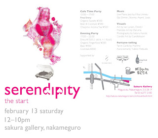
I’ll be exhibiting a number of illustrations drawn for the recent Blunt Mechanic CD on Barsuk Records on February 13th at the Sakura Gallery in Nakameguro.

The exhibition is an all-day art party and exhibition, running from noon until 10pm.

Sakura Gallery
Meguro-ku
Nakameguro 2-5-28 1F
Tel. 03-6277-2100

Supported by Niigata Beer, Chazymo, Aroma Tea Ale, and Mooring Deck.
map here.

Posted in Opinion | Leave a comment