
This is going to be a good one!
FRIDAY, APRIL 2nd AT BRANX: $5.
Tunnels Listen to Eruption on his myspace page–you will be sold.
Sexual Champions (all female improv brass ensemble.)
Kathleen Keogh of Woolly Mammoth comes to Dinner with White Rainbow
DJs:
Hostile Tapeover
DJ Magic Beans (Maggie Vail, VP of Kill Rock Stars)
PHOTOS BY:
A.M. O’Malley
&
Brook Dillon.
Photo portraits/booth by Lorenzo Triburgo.


Urban Honking
is a community of writers, visual artists, musicians, filmmakers, and other great humans.
-
Recent Posts
Recent Comments
- Doug Heckaman on Remembering Chava Ben-Amos
- Ad Tolhuijs on Remembering Chava Ben-Amos
- gabriel on Trumpenstein
- Henrietta McS on Mourn Heal Act
- Bruno Barreto Rosa on About
Archives
- June 2019
- April 2019
- February 2019
- January 2019
- December 2018
- November 2018
- October 2018
- September 2018
- August 2018
- July 2018
- May 2018
- April 2018
- November 2017
- October 2017
- September 2017
- July 2017
- May 2017
- April 2017
- December 2016
- November 2016
- October 2016
- September 2016
- April 2016
- February 2016
- September 2015
- August 2015
- July 2015
- April 2015
- March 2015
- February 2015
- January 2015
- October 2014
- August 2014
- May 2014
- April 2014
- March 2014
- February 2014
- January 2014
- December 2013
- September 2013
- August 2013
- July 2013
- June 2013
- May 2013
- April 2013
- March 2013
- February 2013
- December 2012
- November 2012
- October 2012
- June 2012
- May 2012
- April 2012
- March 2012
- February 2012
- January 2012
- December 2011
- November 2011
- October 2011
- September 2011
- August 2011
- July 2011
- June 2011
- May 2011
- April 2011
- March 2011
- February 2011
- January 2011
- December 2010
- November 2010
- October 2010
- September 2010
- August 2010
- July 2010
- June 2010
- May 2010
- April 2010
- March 2010
- February 2010
- January 2010
- December 2009
- November 2009
- October 2009
- September 2009
- August 2009
- July 2009
- June 2009
- May 2009
- April 2009
- March 2009
- February 2009
- January 2009
Categories
- 5boro
- 9/11
- ACLU
- action
- Advertising
- AIM
- Al Jaffee
- aliens
- American Indian Movement
- animation
- Arakawa
- Art
- art tag sale
- Atole
- awesomeness
- baltimore book festival
- bananafish
- bob dylan
- books
- branding
- brooklyn banks
- Burning Man
- call for entries
- carson ellis
- charity
- christina seely
- Collateral Damage
- comics
- consumption
- corporate greed
- Crap Hound
- culture
- dan attoe
- dance
- Death Magazine
- Dee Hock
- Design
- design event portland
- Disjecta
- DIY
- DJ Miracles Club
- DJ Yeti
- Download
- dreams
- E*Rock
- Ed Fella
- editorial design
- Elvis
- erik stotik
- events
- fart
- film
- finger
- fonts
- fundraising
- Future Tense Books
- Gastronomy
- graphic design
- Guerrilla Girls
- handmade
- Ian Lynam
- ice cream
- iggy pop
- illustration
- inception
- information design
- interview
- iraq
- James Acord
- Japan
- jerks
- Jessica Jackson Hutchins Stephanie Snyder
- jon raymond
- joshua berger
- justine kurland
- kanji
- kay rosen
- Kevin Sampsell
- kick-ass ladies
- kickstarter
- laura russo gallery
- Leonard Crowdog
- Leonard Peltier
- light
- limited edition
- Linda K. Johnson
- literature
- locally owned business
- lords of apathy
- lots of good wonderfulness
- Love
- Love etc.
- luba lukova
- lux
- manga
- markers of time
- matthew williams
- mccain
- mccarren pool
- McDonald's
- Media
- memorial
- michael brophy
- Michael Jackson
- Michael Jackson Memorial
- Mildred Pierce
- milton glaser
- MP3 Download
- Music
- NEA
- New Oregon
- New Oregon Interview Series
- Newsweek
- Newsweek redesign
- Newt Gingrich
- NYCamo
- obama
- OnCreativity
- Opinion
- Oz Cooper
- paper
- pdx contemporary art
- peace
- photography
- PICA
- plazaar
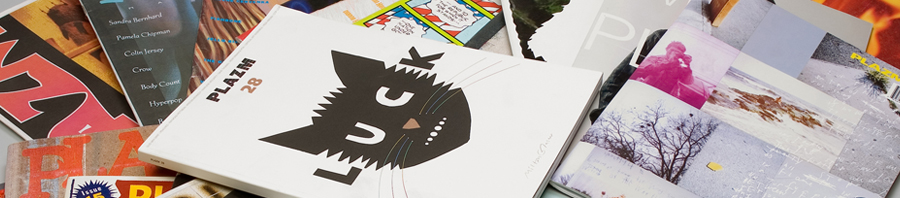
- plazm
- plazm #10
- Plazm #14
- plazm #27
- Plazm #29
- plazm #30
- plazm #5
- Plazm #9
- Plazm 20th anniversary
- Plazm events
- plazm magazine
- plazm thread
- pm
- Politics
- pool aid
- portland
- portland galleries
- Posters
- pranks
- printing
- publishing
- Purple and Green
- Queens
- racial profiling
- radness
- Randy Gragg
- rant
- reality
- Red Bull Theater
- redesign
- Reversible Destiny
- Rick Valicenti
- Rock Camp for Girls
- rocketship
- sarah gottesdiener
- shopping bag design
- Show and Tell Press
- Signage
- Silkscreen
- skate
- Smegma
- space
- sparking change
- Sport
- stamps
- stephen hayes
- steve rodriguez
- storm tharp
- Street
- Strength
- summer
- t-shirts
- Tae Won Yu
- tarot
- TBA
- technology
- the most
- The Portland Stamp Company
- todd haynes
- Twentieth Anniversary
- type design
- Typography
- undead
- unembedded
- Video
- VISA
- W
- Wallpaper
- war resisters
- web design
- Woolly Mammoth Comes to Dinner
- word cloud
- wordle
- Wordshape
- Wordstock
- zine
- zombies
Meta