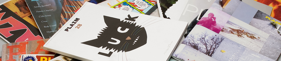

Plakatsammlung Museum fur Gestaltung Zürich—the international poster museum based in Switzerland—has recently ascended over 90 Plazm posters into their permanent collection. A sampling of these posters created from 1992–2000, are shown here. Designers include Plazm folks as well as guests such as David Carson, Scott Clum, Pablo Medina, and many others. Pictured above, a call to sumbit. Designed by Niko Courtelis and Robert Rasmussen (pictured), Photographed in one shot with projection by Bob Waldman. Enjoy.


Urban Honking
is a community of writers, visual artists, musicians, filmmakers, and other great humans.
-
Recent Posts
Recent Comments
- Doug Heckaman on Remembering Chava Ben-Amos
- Ad Tolhuijs on Remembering Chava Ben-Amos
- gabriel on Trumpenstein
- Henrietta McS on Mourn Heal Act
- Bruno Barreto Rosa on About
Archives
- June 2019
- April 2019
- February 2019
- January 2019
- December 2018
- November 2018
- October 2018
- September 2018
- August 2018
- July 2018
- May 2018
- April 2018
- November 2017
- October 2017
- September 2017
- July 2017
- May 2017
- April 2017
- December 2016
- November 2016
- October 2016
- September 2016
- April 2016
- February 2016
- September 2015
- August 2015
- July 2015
- April 2015
- March 2015
- February 2015
- January 2015
- October 2014
- August 2014
- May 2014
- April 2014
- March 2014
- February 2014
- January 2014
- December 2013
- September 2013
- August 2013
- July 2013
- June 2013
- May 2013
- April 2013
- March 2013
- February 2013
- December 2012
- November 2012
- October 2012
- June 2012
- May 2012
- April 2012
- March 2012
- February 2012
- January 2012
- December 2011
- November 2011
- October 2011
- September 2011
- August 2011
- July 2011
- June 2011
- May 2011
- April 2011
- March 2011
- February 2011
- January 2011
- December 2010
- November 2010
- October 2010
- September 2010
- August 2010
- July 2010
- June 2010
- May 2010
- April 2010
- March 2010
- February 2010
- January 2010
- December 2009
- November 2009
- October 2009
- September 2009
- August 2009
- July 2009
- June 2009
- May 2009
- April 2009
- March 2009
- February 2009
- January 2009
Categories
- 5boro
- 9/11
- ACLU
- action
- Advertising
- AIM
- Al Jaffee
- aliens
- American Indian Movement
- animation
- Arakawa
- Art
- art tag sale
- Atole
- awesomeness
- baltimore book festival
- bananafish
- bob dylan
- books
- branding
- brooklyn banks
- Burning Man
- call for entries
- carson ellis
- charity
- christina seely
- Collateral Damage
- comics
- consumption
- corporate greed
- Crap Hound
- culture
- dan attoe
- dance
- Death Magazine
- Dee Hock
- Design
- design event portland
- Disjecta
- DIY
- DJ Miracles Club
- DJ Yeti
- Download
- dreams
- E*Rock
- Ed Fella
- editorial design
- Elvis
- erik stotik
- events
- fart
- film
- finger
- fonts
- fundraising
- Future Tense Books
- Gastronomy
- graphic design
- Guerrilla Girls
- handmade
- Ian Lynam
- ice cream
- iggy pop
- illustration
- inception
- information design
- interview
- iraq
- James Acord
- Japan
- jerks
- Jessica Jackson Hutchins Stephanie Snyder
- jon raymond
- joshua berger
- justine kurland
- kanji
- kay rosen
- Kevin Sampsell
- kick-ass ladies
- kickstarter
- laura russo gallery
- Leonard Crowdog
- Leonard Peltier
- light
- limited edition
- Linda K. Johnson
- literature
- locally owned business
- lords of apathy
- lots of good wonderfulness
- Love
- Love etc.
- luba lukova
- lux
- manga
- markers of time
- matthew williams
- mccain
- mccarren pool
- McDonald's
- Media
- memorial
- michael brophy
- Michael Jackson
- Michael Jackson Memorial
- Mildred Pierce
- milton glaser
- MP3 Download
- Music
- NEA
- New Oregon
- New Oregon Interview Series
- Newsweek
- Newsweek redesign
- Newt Gingrich
- NYCamo
- obama
- OnCreativity
- Opinion
- Oz Cooper
- paper
- pdx contemporary art
- peace
- photography
- PICA
- plazaar
- plazm
- plazm #10
- Plazm #14
- plazm #27
- Plazm #29
- plazm #30
- plazm #5
- Plazm #9
- Plazm 20th anniversary
- Plazm events
- plazm magazine
- plazm thread
- pm
- Politics
- pool aid
- portland
- portland galleries
- Posters
- pranks
- printing
- publishing
- Purple and Green
- Queens
- racial profiling
- radness
- Randy Gragg
- rant
- reality
- Red Bull Theater
- redesign
- Reversible Destiny
- Rick Valicenti
- Rock Camp for Girls
- rocketship
- sarah gottesdiener
- shopping bag design
- Show and Tell Press
- Signage
- Silkscreen
- skate
- Smegma
- space
- sparking change
- Sport
- stamps
- stephen hayes
- steve rodriguez
- storm tharp
- Street
- Strength
- summer
- t-shirts
- Tae Won Yu
- tarot
- TBA
- technology
- the most
- The Portland Stamp Company
- todd haynes
- Twentieth Anniversary
- type design
- Typography
- undead
- unembedded
- Video
- VISA
- W
- Wallpaper
- war resisters
- web design
- Woolly Mammoth Comes to Dinner
- word cloud
- wordle
- Wordshape
- Wordstock
- zine
- zombies
Meta