RAD HATTER for First Thursday

“Rad Hatter” invites Portland to check out the new Tender Loving Empire gallery-shop-etcetera space downtown… and invited some 40 local artists to transform trucker hats into wearable art. Folks like Mona Superhero and Chris Haberman are making hats; all will be priced under $50.

Plazm editor Tiffany Lee Brown has a piece in the show: a wearable, portable, personal gallery. “FAA: Fully Autonomous Art gallery” comes pre-loaded with a group show of miniature artworks by Gary Wiseman, Mildred Galore, Clare Carpenter, Stacey Tigner Loy, and Christine Toth, and a show catalog by Allison Dubinsky.

If you try out Tiffany’s hat, be sure to turn on and position the studio lights. And should you decide to purchase it, proceeds will benefit New Oregon Arts & Letters, the nonprofit organization now publishing Plazm magazine and this fine blog.

Thursday, July 1, 2010, 6-10 pm
Tender Loving Empire
412 sw 10th Avenue at Stark / Ace Hotel block

Posted in Opinion | Leave a comment

Typographic Ballet

Also tonight, our industrious friends over at wk12 and fashion buddha in collaboration with Oregon Ballet have created a dynamic typeface from dance. The font is called Ligne and is based on the physical movements of two Oregon Ballet dancers, Grace Shibley and Lucas Threefoot along with the work of choreographer Candace Bouchard. The dancers were fitted with LED lights, which captured their steps in real time as they danced all 26 letters of the alphabet. Motion-capture was used to record the movements and subsequently form the letters of Ligne.

You can download the typeface here: www.balletfont.com

Tonight from 6-8 pm in the lobby of the Portland Center Stage Armory, there will be a performance of the type ballet. Also live DJ sets from Let’s Go Outside and Mr. Ballistic.

128 NW 12th

Posted in events, Typography | Leave a comment

Walt Curtis Benefit / Birthday Event


Back in 1991 when Plazm first launched Walt Curtis was an early supporter bringing myself, Neva Knott, Patrick Bardel, and Rueben Nisenfeld on to his KBOO radio program The Talking Earth. A few years later Carl Hanni did a great interview with Walt which we featured in Plazm #3. That was posted on our web site not too long ago. 


Walt lost everything in a catastrophic fire May 2 which also destroyed the Great NW Bookstore. His 69th birthday is on the Fourth of July… You can come celebrate Walt and help him get back on his feet. $10 cover. Additional donations by check, credit card, or paypal can be arranged that evening. 


An exciting evening of spoken word performances by top Portland poets and writers, including Tom Spanbauer, Oregon Poet Laureate Paulann Petersen, and others, live jazz by Nancy King and Glen Moore, DJs and surprises. This is a benefit for poet/painter Walt Curtis, author of Mala Noche, which became Gus Van Sant’s first film.


Apparently the event will also be filmed. 


Start Time:
Thursday, July 1, 2010 at 8:00pm
End Time:
Friday, July 2, 2010 at 1:00am
Location:
Berbati Pan
Street:
231 SW Ankeny
City/Town:
Portland, OR
Posted in events | Leave a comment

Neither Higher Nor Lower Opening Friday

My last solo art show in PDX in a loooong time opens on Friday at Nationale. 6-9
Here’s the info:
Sarah Gottesdiener presents new work at NATIONALE, with contributors Jenstar Brockman, Michelle Calvert, Lacy Davis, Kaetlin
Kennedy, Aaron Montaigne & Publication Studio
“One of the temptations of an artist is to believe himself solitary….But this is not true. He stands in the midst of all, in the same rank,
neither higher nor lower, with all those who are working and struggling. This is why any authentic creation is a giſt to the future.”

—Albert Camus, The Artist and His Time

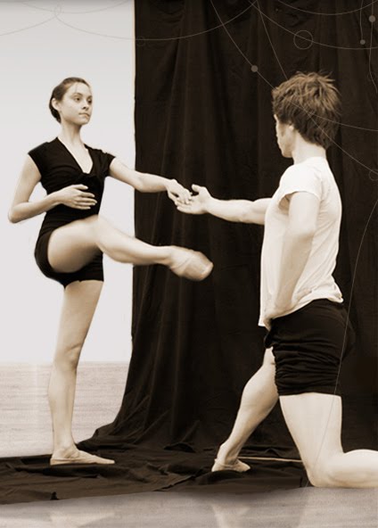
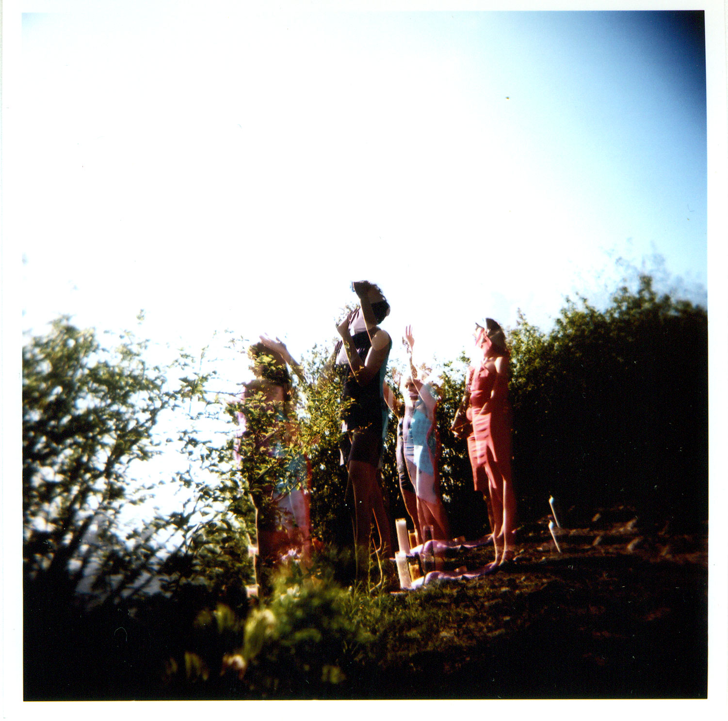
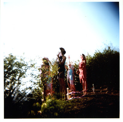
Over the course of the last few months, Gottesdiener asked four other artists to give her instructions for living. Each time, she took their advice for the duration of one week, and then made art from the ideas their directions had inspired. This process culminated with a ritual involving all parties and designed to charge their creative energy.

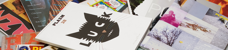
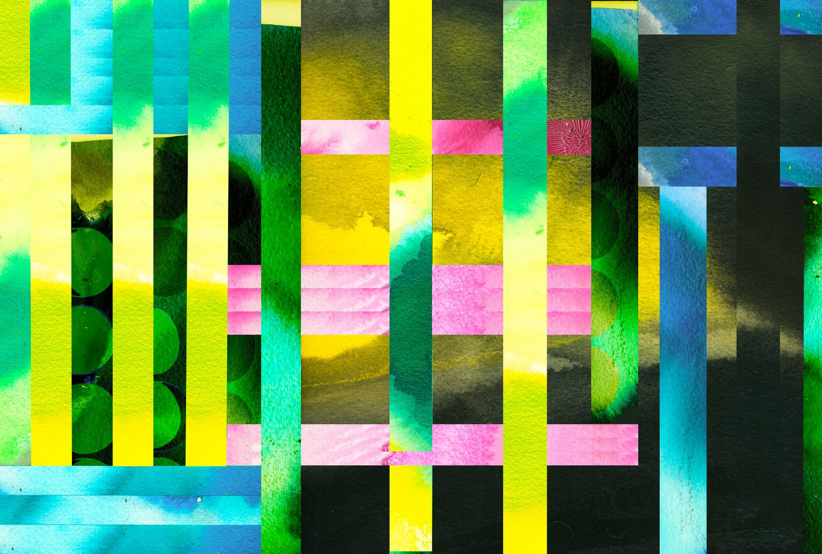
The work presented here, which includes photographs, paintings, silkscreens, and books published by Publication Studio, intends to be a celebration of collaboration, inspiration, friendship, and the energy of action and living.

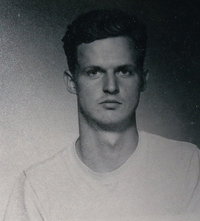
Sarah Gottesdiener is an artist and musician from Hartford, CT, now living in Portland, OR. Primarily a painter, her practice also includes fashion design, sculpture, print making, curating, writing, party throwing, installation, music, and graphic design. Her visual work has been shown extensively in Portland, as well as in San Francisco, New York, Miami, Amsterdam, and Canada. With remarkable co-organizer Jenny Hoyston, she throws the art happening Art Party at Branx every month. Gottesdiener also plays percussion and sings in the bands Matrimony and Atole. This exhibit will be her last in Portland for a while as she will be attending CalArts to obtain her masters of graphic design this fall.

SAVE THE DATES
On view July 2nd – August 1st, 2010
Opening reception First Friday July 2nd, 6/9pm
Artist talk and presentation Thursday July 15th, 7pm (as part of our membership events)
NATIONALE
811 East Burnside
Portland, OR
503.477.9786

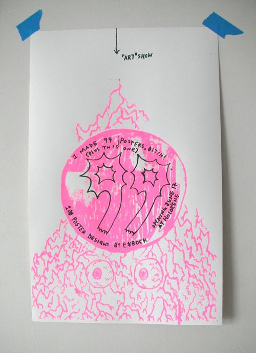
And here are some peeks:


More information at:

www.thenewnationale.com

Posted in Opinion | 1 Comment

Oil Be Damned: Is My Trip Necessary?

J. P. Townley created the poster above, riffing on the WW II messaging below. Free download to use or print as you like, the images are also free for changing and updating. Townley says the poster is “not quite there.” Give it a shot yourself!

Posted in Opinion | Leave a comment

Plazm to participate in De Zines exhibition, Barcelona Spain. Opening 29th of June

‘De Zines’ is an attempt to reflect and catalog contemporary editorial creation within independent publications today and how this work relates to the current social, cultural, and political environment. Around 400 international publications have been gathered from established magazines to handmade ‘zines and a selection of experimental magazines.

In a time of constant technological evolution and immediate access to information through the electronic network, paper, as a media for the dissemination of culture and information, seems destined to disappear. However, the number of small, independent publications continues to grow. Digital and analogue can coexist, and, in fact, can serve vastly different purposes. While digital is immediate and global in its distribution, analog is selective, tactile, and durable. 
‘De Zines’ posits that independent publications—descendants of punk, Dada, the Situationists, and the Fluxus movement, among others—will remain a vital part of the future of media for some time. The exhibit is articulated as a consultation room, a space that does not only creates traffic but a place to stay. To “create networks among people with a similar vision in a global and plural world.”

Inéditos 2010
29 June to 29 August 2010 / Room A
Ronda Valencia, 2
28012 Madrid – Spain
T +34 902 43 03 22

La Casa Encendida is open from Monday to Sunday from 10 a.m. to 10 p.m. every day of the year except national and Community of Madrid holidays.
Posted in events, plazm magazine, zine | Leave a comment

IDEA Magazine #341

New issue of IDEA on newsstands now!

featuring:

Critical Mass
Compiled by Ian Lynam + Idea magazine

A 100-page inquiry into contemporary critical practices in graphic design featuring: 
Mark Owens, Zak Kyes, Jon Sueda, Brian Roettinger, Daniel Eatock, Scott Ponik, Michael Worthington, Yasmin Khan, and Metahaven.

The feature includes two new lengthy essays:

Subterranean Modernism: A Critical Retrospective
By Randy Nakamura + Ian Lynam

On the Uselessness of Design Criticism 
by Randy Nakamura

Critical Mass offers a comprehensive overview of not only critical graphic design practices, but a critical look at the recent history of graphic design, citing undercurrents of informed practice and the effects of historical influence.

Posted in Opinion | Leave a comment

Cooper Black Condensed

New typeface release from Wordshape/MyFonts:

Cooper Black Condensed is a less wide, but not squished variation on Cooper Black.

The history of this typeface:

Cooper Black, the most famous and successful of Oswald Cooper’s type designs was released in 1920, following a year of development fleshing out the weight of the typeface and filling out the full character set. Cooper redrew the lowercase characters multiple times, toying with the rounded forms of the “m” and “n” and engaged in a lively debate with Barnhart Bros. & Spindler’s General Manager Richard N. McArthur over the final form as McArthur requested that the typeface be drawn bolder and bolder. Cooper famously said the face was “for far-sighted printers with near-sighted customers”, and the public agreed. Sales of Cooper Black were voluminous, and Barnhart Brothers & Spindler had a difficult time keeping up with the demand for the typeface. Conservative typographers were critical of Cooper Black, though it was overwhelmingly popular, helping to shape the American advertising landscape through the 1920s and 1930s.

1925 saw the release of Cooper Black Condensed, a “condensed but not squeezed” variation on the Cooper Black theme. McArthur and Cooper had the usual lively back-and-forth over the shapes of some of the letterforms, in particularly the uppercase “Q”, resulting in a thoroughly accomplished alphabet. The first showing specimen of Cooper Black Condensed compared the new face with Cooper Black, showing that it was 20 less wide and that it promised to “show something of gentility while being able to spit on its hands and make itself useful”.

This typeface is the result of researching and faithfully redrawing characters from Cooper’s original drawings and series of engraved proofs for the typeface. The typeface includes the full range of punctuation and diacritics that fill out a full character set. The typeface has been lovingly kerned for the smoothest result in text setting.

Posted in Opinion | Leave a comment

E*Rock poster show 6/17

E*Rock was featured in Plazm #28 and has collaborated on a bunch of Plazm projects over the years. Here’s a great opportunity to check out a bunch of his posters in one place, plus some rad music. 
“I Made 99 Posters, Bitch! (Plus This One)”: 100 Poster designs by E*Rock
Opening Thursday, June 17 @ Holocene, as part of this show:
A Few of My Favorite Things : An evening curated by Kathy Foster (of The Thermals)
Featuring music by: Y La Bamba, Love Always (Kathy Foster solo), STLS, DJ E*Rock, DJ Magic Beans. Plus dance performances by: Kathleen Keogh (in a dance/music collaboration with The Slaves), Jin Camou. Plus installations by local visual artists! 
All proceeds benefit Planned Parenthood.
Posted in Design, events, Posters | Leave a comment

INTERNO!

Interno is the latest typographic offering from Wordshape.

Interno is a headline typeface built from a Walter Ballmer Olivetti logo exploration drawn sometime in 1960. Work on Interno commenced in 2006, but was soon abandoned. In 2009, Eli Carrico picked it up and ran with it, completing Interno 1. I picked through Eli’s development stages of the typeface and edited together a slightly different version, Interno 2, utilizing a mix of development characters and original characters.

Interno is Italian for internal (or at least that is what the translation widget told us). A great deal of the classic Olivetti design was down in-house (i.e. internal). Also, the typeface has internal switchbacks reminiscent of a paperclip. Interno sounds a bit like “turning inside” phonetically(In-Turn-O). Additionally, Interno takes the first letter and last letter of Olivetti and flips it.

Posted in Opinion | Leave a comment